For this piece, I really wanted to try and solidfy my artstyle. My 87 poster was the first piece that I made that had this geometric style, so I found it fitting to try and remake it with my modern skills and techniques.
Using the symmetry tool, I sketched out the basic shapes. This is a highly stylistic piece, so the sketch wasn't too different from the final line. Lineart and base coloring was very simple as usual, so I was quickly able to move onto shading and detailing.
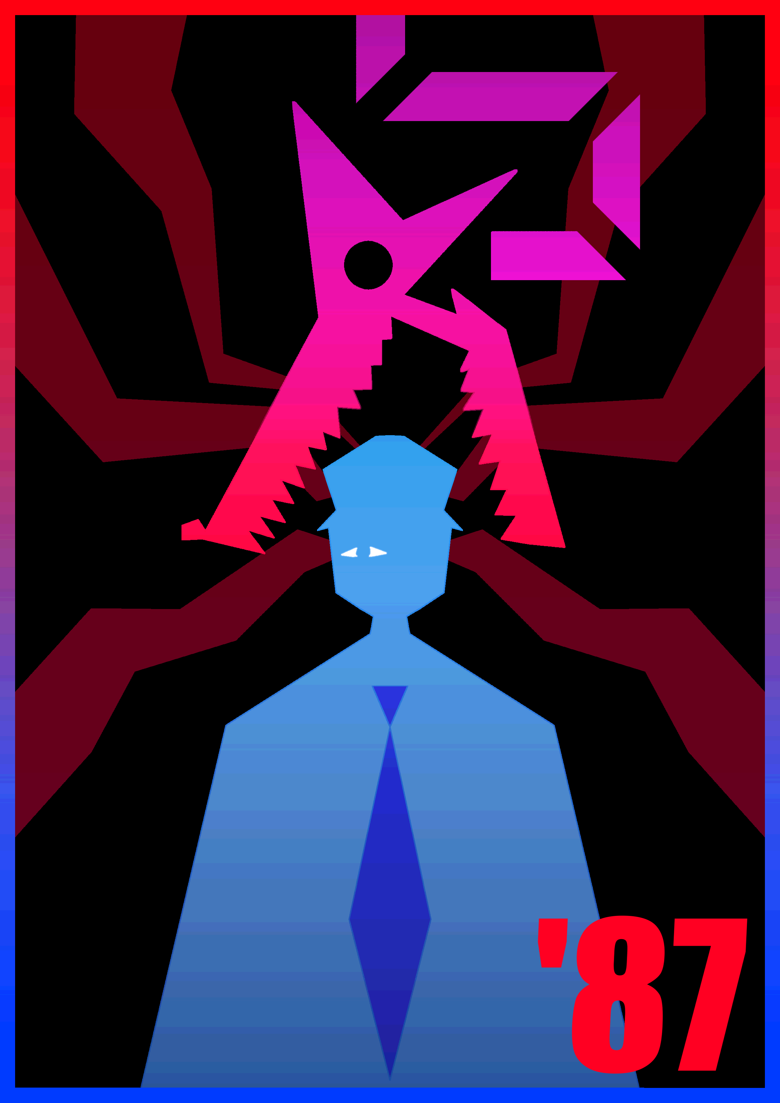
I was very pleased with how the final details turned out with this piece. The gradients are all really nice on the eyes, and I love the border. The 87 in the bottom right just works so perfectly for me and I'm very glad I decided to go with that as opposed to how the 87 was positioned in the original. Also, the way that Mangle's neck is segmented is so satisfying to me, and the red shapes extending from Jeremy's head being a lower opacity works very well. After posterizing it, as always, I was ready to export the piece.
Overall, I was very, very pleased with this remake. I think the quality has improved in every conceivable way. The posing is symmetrical, the colors are much more aesthetically pleasing, and the composition in general has been improved. This is one of my favorite posters I've ever made, and I'm very proud of it.