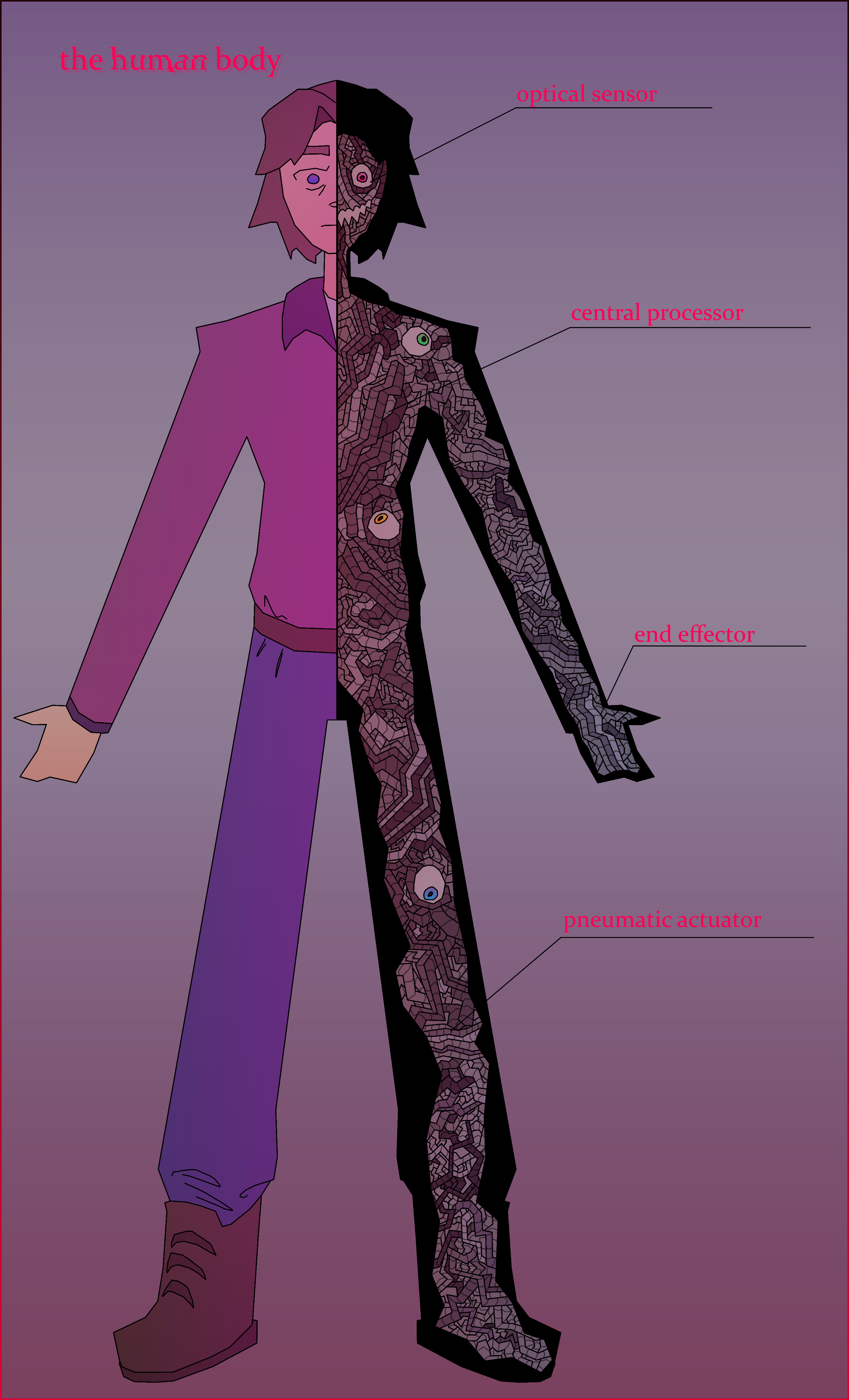
Another poster style drawing, this one being inspired by classroom anatomy posters. Mike and Ennard are my two favorite characters and I always loved how Sister Location ended, and I thought this was clever. That being said, I'm not entirely happy with the result. I think the idea is really good, but the artsyle may not have been right for it. I don't really know. The background is also not very good; I've never been great with backgrounds. I also made the image far too tall and it's hard to view normally without zooming out and losing a lot of detail, like the wires. I'm also not sure how I feel about the gradients. I might remake this piece in the future with a different artstyle or coloring method, because again, I do really like the concept. I do like how the glitch effect on the word "human" came out, though. Ennard himself also looks good, although the wires took ages to draw. Also I like how Ennard's eyes came out, I think they look nice.