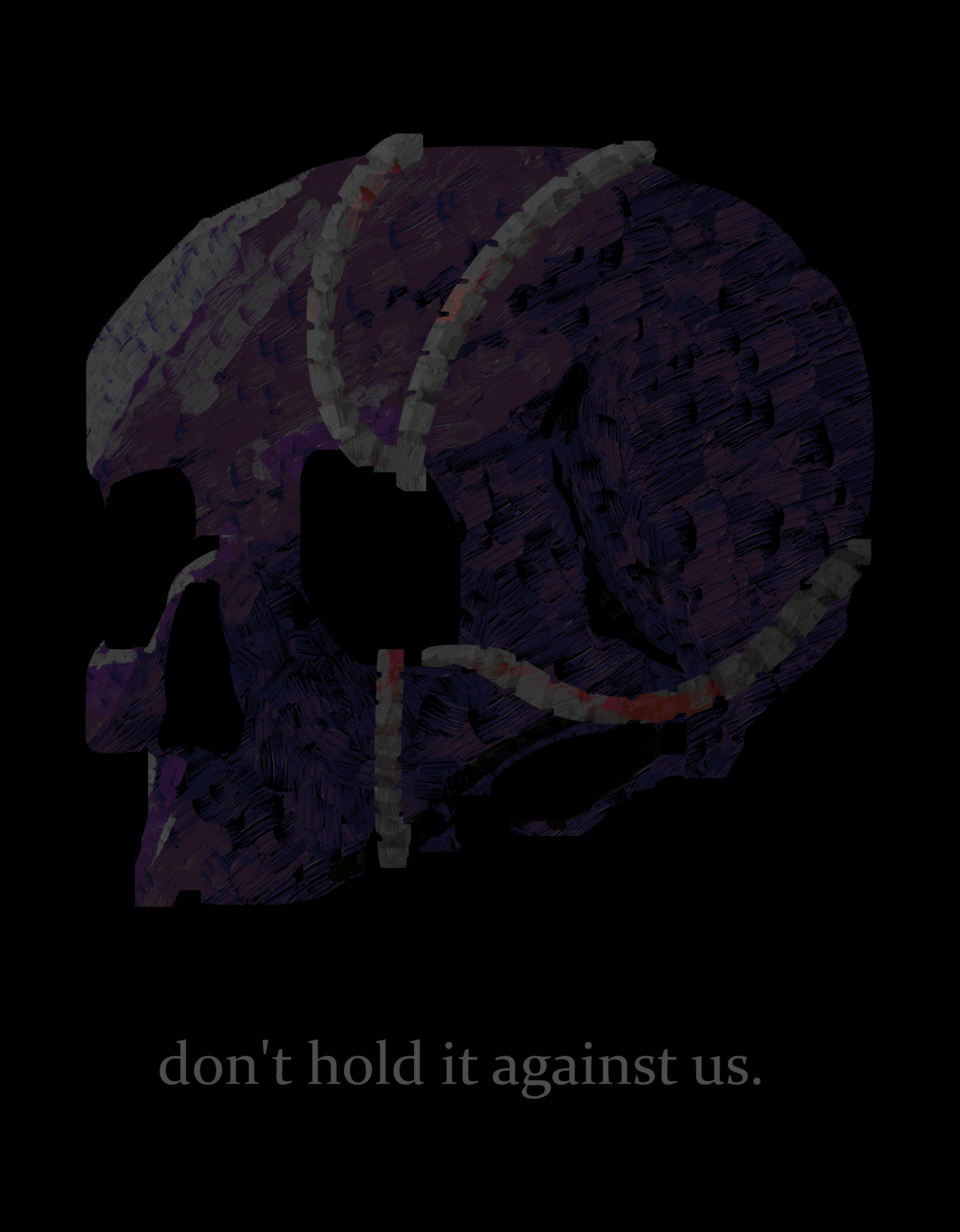
I kind of knew what I wanted the piece to look like from the start; Mike's skull with wires coming in and out of the different holes in the face. To start, I used a large, plain brush to create the general form of the skull. I followed a reference pretty closely, so that's why it looks pretty accurate (in my opinion at least). It took me a while to get the eye sockets to a point where I was satisfied, but other than that it all went very smoothly.
Next up were the wires. These were slightly more challenging. It took me several different attempts to land on the configuration of wires that I did. Honestly, I could have probably done better with the placement of the wires; I think they could provide a unique opportunity to explore the contours of the skull. I also had trouble making them fit with the more realistic style I was going for. I ended up doing the sort of segmented look to them, which I did by just carving small sections of each wire with the eraser tool. I was actually inspired by the flexible cables used in shower heads, which is something I thought of quite a while ago but never really did anything with.
Onto the coloring, I first simply colored the main outline of the skull a greyish-purple and the wires a light grey. I ended up switching between a few different shading methods until I settled on using the brush I did. The shading of the skull was rather straightforward; I just shaded with regards to the light being in the top left. The reference helped a lot with figuring out the shading. Once again, the wires proved slightly more difficult. I ended up using a black brush on low opacity over the main color layer in order to color the connections between each wire segment. I did this just to add extra depth to the cables and make them seem more 3D. I also decided to add some light oranges for rust and a little bit of red for blood.
Lastly, I applied a few filters to round everything off. I adjusted some of the saturation values, then burned it (of course). I ended up palletizing it as well, which worked out pretty well, especially with making the blood stains on the wires far brighter than the original colors. I also posterized it, just for good measure. To finish everything, I added the text, which I played around with a bit before landing on the single line, all lowercase, low opacity format that I did.
Overall, this was a pretty fun piece to make. At the time, I was experiencing major artblock, so being able to just open Krita and make something was very refreshing. I think the piece itself is also pretty good; I'm particularly proud of the way the shading makes the zygomatic arch very pronounced (I think that's what that part of the skull is called). The posterior part of the skull could use some work though, it does look a little flat. Other than that, very satisfied.