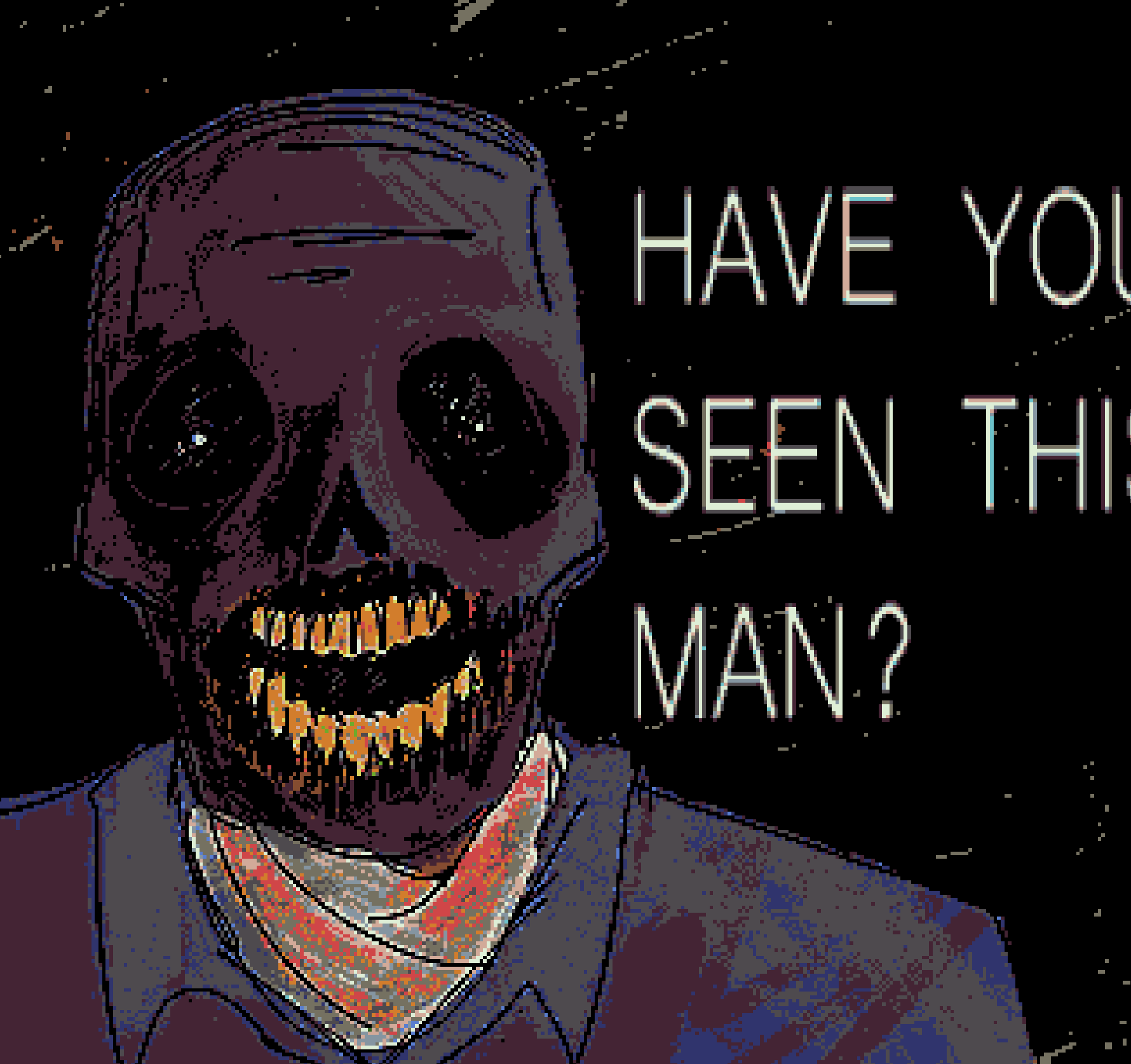
This is a drawing that didn't actually start out as a full piece, but I liked it enough to put it here (it was originally just a sketch of Mike in the pose of Willem Dafoe holding two oranges). I was really in kind of a Mike streak, and I was having a lot of fun painting him at the time, and I just ended up experimenting with this and it turned out really well I think.
Essentially what I did was I just used a very thin pen brush to make the lineart, then made that brush larger to make the flat colors. After that, I used a generic paintbrush to shade and paint. For Mike, I like to shade using blacks and even dark greens on top of the very dull, grey purple. I really want it to feel like necrotic tissue, and not just like, a guy with purple skin. I also used some faded reds around the mouth, just cuz like that part especially would've been kinda messed up. I actually had to redo the mouth a couple of times to get it to a point where I liked it. With that being said, though, I feel as though the teeth could have used some work. I think what would have been better is if I made the general shape of them first and then drew each individual tooth; my approach was more like just making a "wave" type line and then drawing the bottom of each tooth, which ended up making it seem lopsided.
For the eyes, I didn't actually intend for it to do this, but the two white lights kinda look like they're illuminating the back of the empty sockets, which I think is really cool. I think that just came about because of how I was coloring in the sockets. Also, I didn't use a reference for the skull anatomy, so it looks a little weird but honestly not too bad. The background was made just by painting broad strokes with a very textured brush in black first, then red, then another layer of black. Finally, I used posterize on the lowest step to make it feel more crusty. For the text, I just wanted it to feel kinda weird, so i used a font I don't use much and stretched it out a bunch. I think it looks neat.
The weird effects are what I think really make the piece. To start, I used sharpen to make everything feel all crusty. Then, I used posterize at a very low step in order to make it feel even more jank. I think I also ended up using palettize, just to make his skin seem a little more purple. I tried using pixelize, but it was a little too much so I scrapped it. Overall, I think the effects make it look really really cool. The word that comes to mind for me is almost "violent," like it just feels aggressive, probably cuz of the posterize and the text and stuff. I think moving forward I kinda want to lean more into this kind of art. It's, in my opinion, what's special about digital art when compared to traditional. You couldn't really make this kind of piece on a canvas, and while yes I do wanna do more like traditional-esque paintings, I also really wanna make more of this weird digital stuff. So yeah, I actually really like this one :D.