Michael Afton AGAIN?!?!
Yeah. I like this guy a lot and wanted to draw him again. The main design philosophy behind this one was to make another geometric poster style drawing, a return to form in a sense. I haven't made one of Michael, so I thought this would be a good idea.
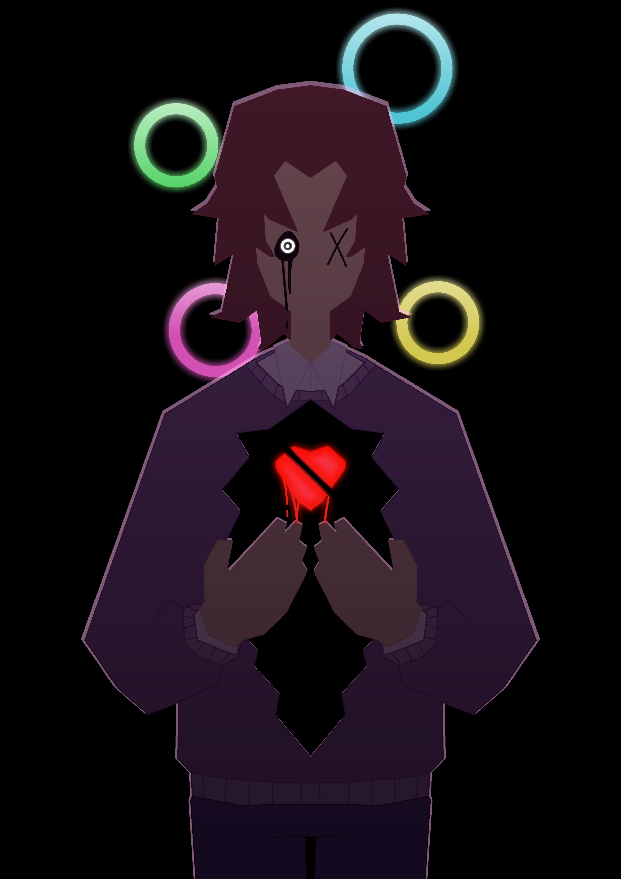
I began sketching using the line tool instead of freehand. I utilized the vertical symmetry axis to ensure a smooth and clean finished product. The pose was rather simple, though the hands and hair took a few tries and touchups to get just right. The design philosophy is very much stylized and angular.
After sketching was complete, I moved onto lineart. To do this, I made a separate layer for each piece of Mike that would be a different color. For example, the skin was one layer, the hair another, and the sweater yet another. I did this so that I could use the paintbucket tool directly on the lineart instead of coloring underneath and erasing and doing a ton of other lame stuff. I used a pixel brush with no anti-aliasing for the lineart, in order to get sharper edges.
Speaking of colors, the method I described worked very well. I ended up using the paintbucket tool to color in the lineart according to what color was inside of it; the hair's lineart was colored brown, the heart's was red, etc. This worked very well, and I was pleased with the final product. After all the base colors were completed, I moved onto adding Mike's eyes, which was rather easy.
Finally, I moved onto finishing touches. I added multiple gradients (black and pink) to the main body to add some spice. At this point, I was figuring out what I wanted the background to be, as I thought it was a bit scarce. I decided on the stylized Ennard eye/ring things. I used a simple colored circle tool, and for the glow I used the painbucket tool with a high feathering radius, in addition to some white gradients on top to add some extra shine. I also did this to the eye and the heart, for some extra fun glow effects. Finally, I made a copy of the body layer and colored it entirely with a pinkish-white color, and layered it behind the main layer. This produced the white outline effects, which I'm pleased with. To top it all off, I used a posterize filter with high step just to add some extra texture.
All in all, I am very happy with the final result. The eyes being two different designs is meant to indicate how Michael exists in a state of in-between; not quite dead but clearly not alive either. The hole in his chest obviously represents the physical wound, as well as the fact that he is left empty and hollowed out by his harrowing experiences, and the cleaved heart is meant to just signify how broken this man truly is at this point. Also the title of "Sacrifice" is just meant to represent how Mike is sent down as a kind of sacrifice in order to free Elizabeth, as well as how Mike sees his death as a sacrifice that would atone for his past mistakes.
On a technical level, this piece is something that I'm very proud of. It is a development of my signature poster style of artwork, and executes those original concepts whilst also introducing some new ones, such as the improved shine and glow effects. I think this piece is a good little symbolic representation of my favorite broken corpse man.