DRAWINGS
DIGITAL ART WITH COMMENTARIES
Return Home
Good Person
January 25 2026

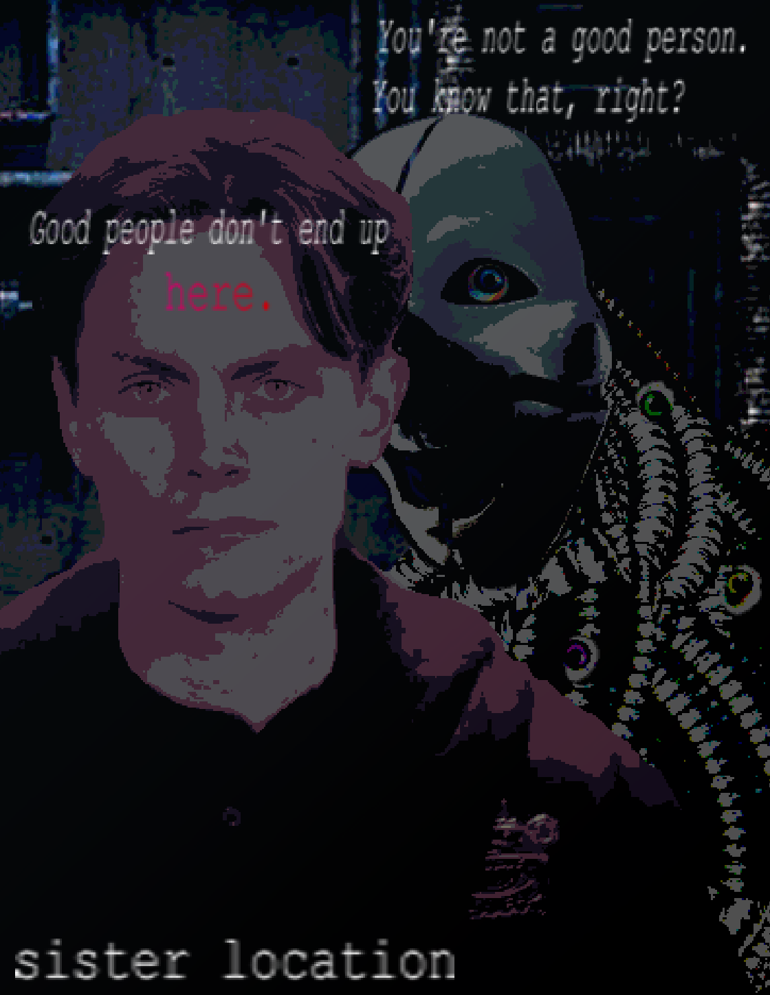
[Michael Afton and Ennard in the bunker]
This piece began as a vague idea to marry Sister Location and Portal, as I was getting back into the latter at the time. Originally, this was going to me a more traditional painting of Michael standing in the elevator and shining his light towards the audience, but I tried it and was not happy with how it was turning out. Several weeks later, I revisited the idea and approached it from a different angle: photobashing. I had done some photobashing in the past, and I usually had a very good time, so I decided to give it a go.
To begin, I had to create an image of Freddy Carter facing forward. To do this, I took a promotional image of him and edited out his face and neck, pasting it onto a shot of Michael Afton's body from the movie. After a bit of cutting, pasting, and smoothing, I was able to get a very decent forward facing shot of Michael. Next was the background, which was just a stock photo of some wall piping. I played around with some posterize and palletize filters and eventually got to a point where I was happy with how the background and Michael both looked. I thought the piece looked a bit empty, so I decided to see if I couldn't find a way to include Ennard.
I searched a bit until I found the PERFECT stock image of a clown mask to use. It was a near perfect match, all that was missing were the ears, lines (obviously), and the eyebrows, which weren't super important to me. Also, the party hat was missing, but I didn't care about that either. I played around with some colors and filters until I got the mask right, and moved on to the wires. For the wires, I used photos of flexible metal conduit, the things used for shower heads. I have thought that these things would be perfect for a real-life Ennard, and I'm very happy with how they look in this piece. For the eyes, I found an image online of an artifical eye that had some computery bits in the sclera, and thought that was perfect. You can't tell in the final piece, but it makes me happy, so I used it. Finally, I moved on to the text, the main point of the piece. I played around with positioning for a while until I settled on the final design. I really like the pure white, courier text. I think it has a very low-budget, unpolished feel to it which really works for this piece. I was greatly inspired by 2000's video game ads (you know the ones), and I think I captured some of that aesthetic fairly well. In playing around with the text, I moved the word "here" to Michael's forehead, and realized that it actually worked really well there. It symbolizes that both the physical location he's in as well as his own mind are both riddled with ghosts and nightmares. I thought that was really neat.
To end it all off, I played around with some filters and gradients, and with the help of the snipping tool, I exported as a PNG. Overall, I'm very, very pleased with the final result. I think it captures the vibe I was going for perfectly. I really enjoyed the process of this one; I'd like to experiment more with photobashing in the future. This piece took me a few hours, and I had a good time with it.
87 (2025)
October 18 2025

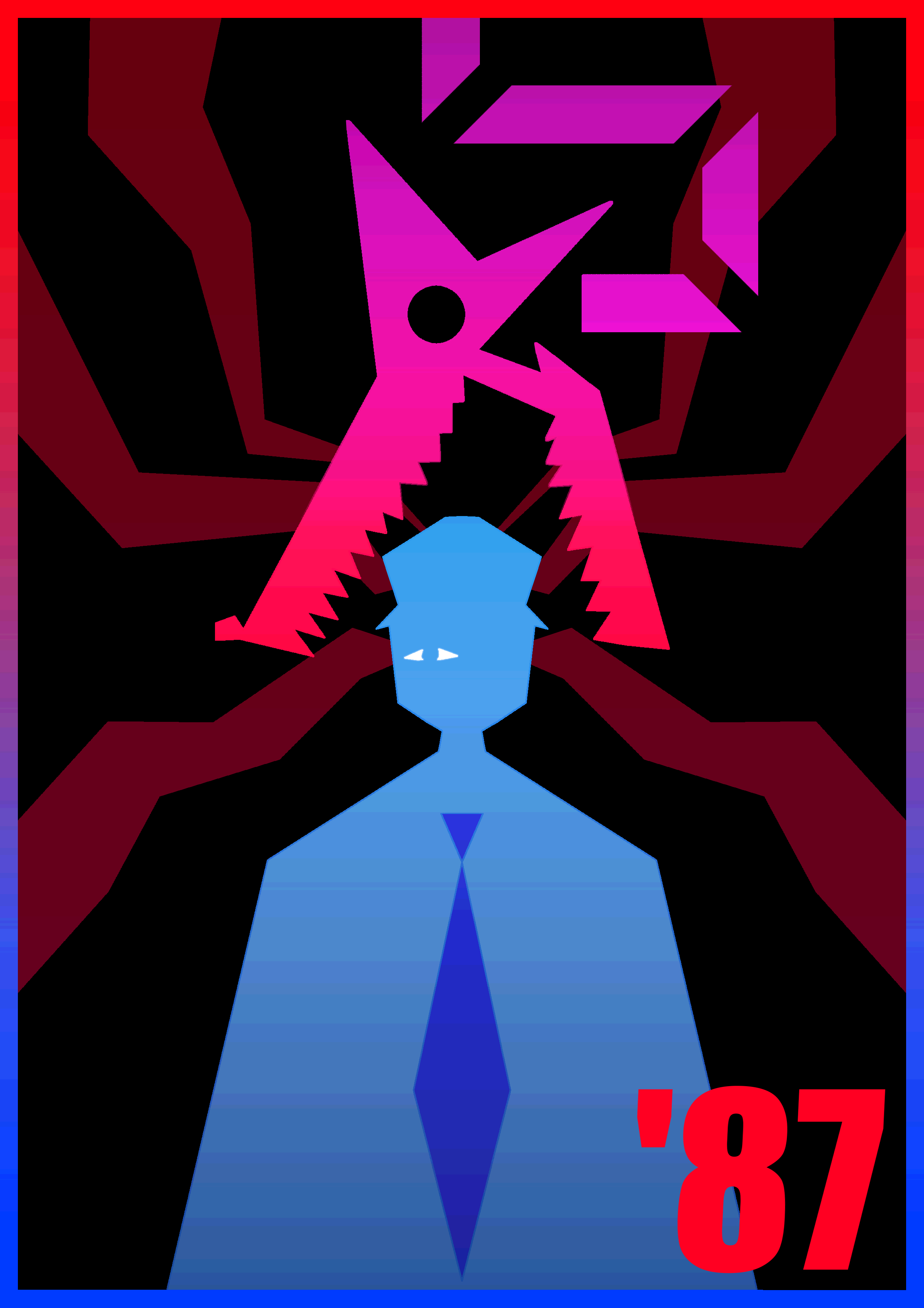
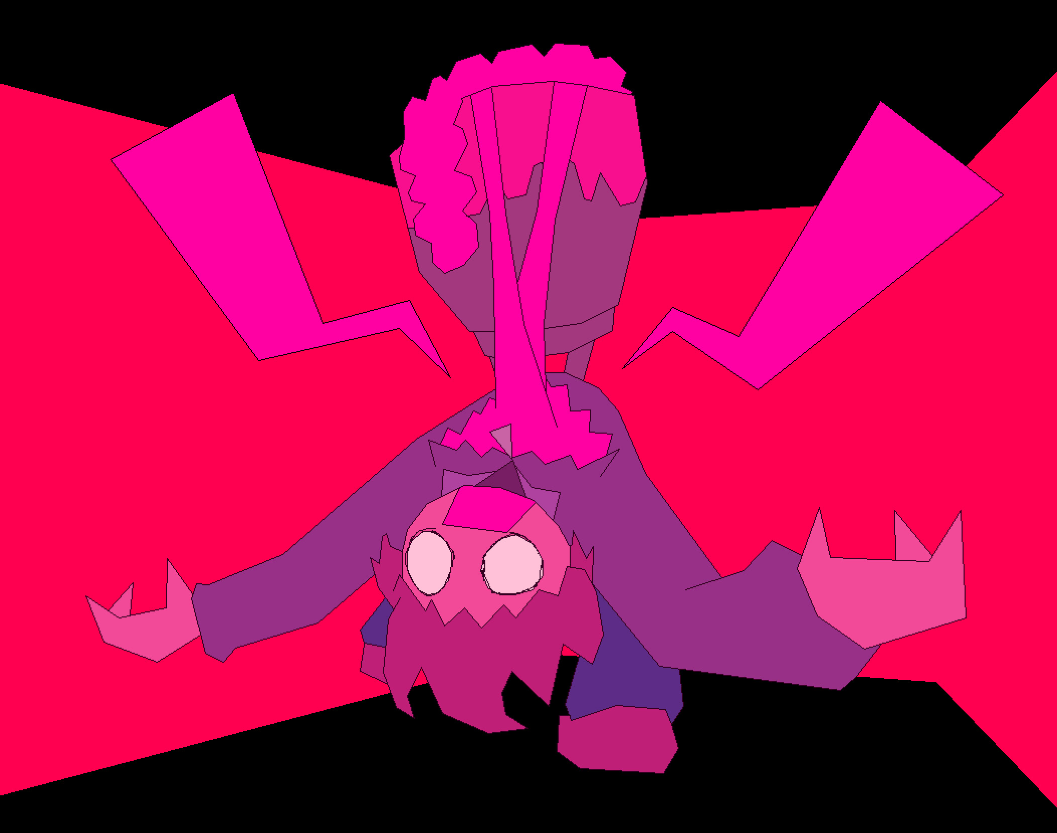
[Mangle prepares to attack Jeremy Fitzgerald]
For this piece, I really wanted to try and solidfy my artstyle. My 87 poster was the first piece that I made that had this geometric style, so I found it fitting to try and remake it with my modern skills and techniques.
Using the symmetry tool, I sketched out the basic shapes. This is a highly stylistic piece, so the sketch wasn't too different from the final line. Lineart and base coloring was very simple as usual, so I was quickly able to move onto shading and detailing.
I was very pleased with how the final details turned out with this piece. The gradients are all really nice on the eyes, and I love the border. The 87 in the bottom right just works so perfectly for me and I'm very glad I decided to go with that as opposed to how the 87 was positioned in the original. Also, the way that Mangle's neck is segmented is so satisfying to me, and the red shapes extending from Jeremy's head being a lower opacity works very well. After posterizing it, as always, I was ready to export the piece.
Overall, I was very, very pleased with this remake. I think the quality has improved in every conceivable way. The posing is symmetrical, the colors are much more aesthetically pleasing, and the composition in general has been improved. This is one of my favorite posters I've ever made, and I'm very proud of it.
Sacrifice
October 1 2025

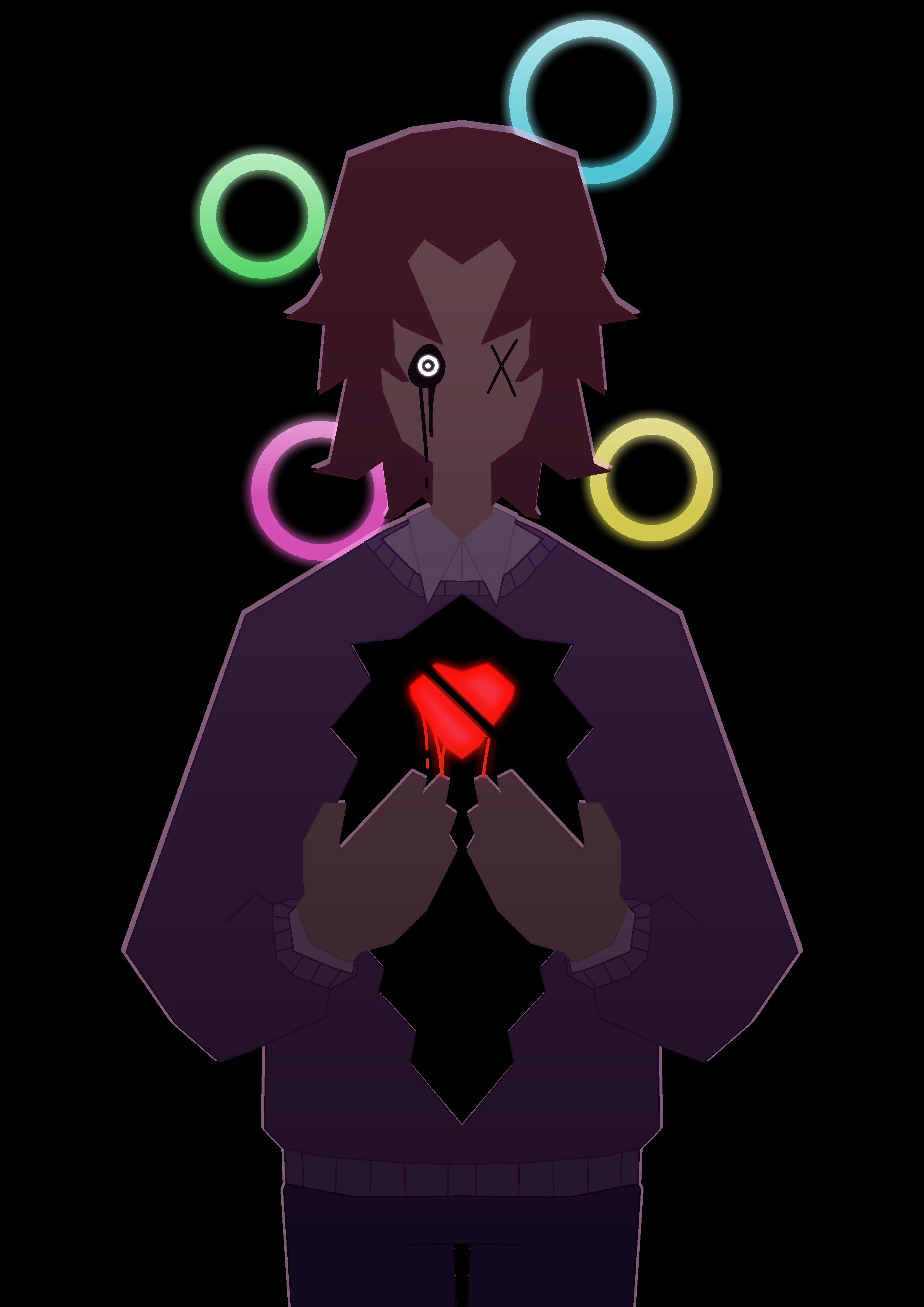
[Stylized portrait of Michael Afton post-scooping]
Michael Afton AGAIN?!?!
Yeah. I like this guy a lot and wanted to draw him again. The main design philosophy behind this one was to make another geometric poster style drawing, a return to form in a sense. I haven't made one of Michael, so I thought this would be a good idea.
I began sketching using the line tool instead of freehand. I utilized the vertical symmetry axis to ensure a smooth and clean finished product. The pose was rather simple, though the hands and hair took a few tries and touchups to get just right. The design philosophy is very much stylized and angular.
After sketching was complete, I moved onto lineart. To do this, I made a separate layer for each piece of Mike that would be a different color. For example, the skin was one layer, the hair another, and the sweater yet another. I did this so that I could use the paintbucket tool directly on the lineart instead of coloring underneath and erasing and doing a ton of other lame stuff. I used a pixel brush with no anti-aliasing for the lineart, in order to get sharper edges.
Speaking of colors, the method I described worked very well. I ended up using the paintbucket tool to color in the lineart according to what color was inside of it; the hair's lineart was colored brown, the heart's was red, etc. This worked very well, and I was pleased with the final product. After all the base colors were completed, I moved onto adding Mike's eyes, which was rather easy.
Finally, I moved onto finishing touches. I added multiple gradients (black and pink) to the main body to add some spice. At this point, I was figuring out what I wanted the background to be, as I thought it was a bit scarce. I decided on the stylized Ennard eye/ring things. I used a simple colored circle tool, and for the glow I used the painbucket tool with a high feathering radius, in addition to some white gradients on top to add some extra shine. I also did this to the eye and the heart, for some extra fun glow effects. Finally, I made a copy of the body layer and colored it entirely with a pinkish-white color, and layered it behind the main layer. This produced the white outline effects, which I'm pleased with. To top it all off, I used a posterize filter with high step just to add some extra texture.
All in all, I am very happy with the final result. The eyes being two different designs is meant to indicate how Michael exists in a state of in-between; not quite dead but clearly not alive either. The hole in his chest obviously represents the physical wound, as well as the fact that he is left empty and hollowed out by his harrowing experiences, and the cleaved heart is meant to just signify how broken this man truly is at this point. Also the title of "Sacrifice" is just meant to represent how Mike is sent down as a kind of sacrifice in order to free Elizabeth, as well as how Mike sees his death as a sacrifice that would atone for his past mistakes.
On a technical level, this piece is something that I'm very proud of. It is a development of my signature poster style of artwork, and executes those original concepts whilst also introducing some new ones, such as the improved shine and glow effects. I think this piece is a good little symbolic representation of my favorite broken corpse man.
Mirror Magic
October 1 2025

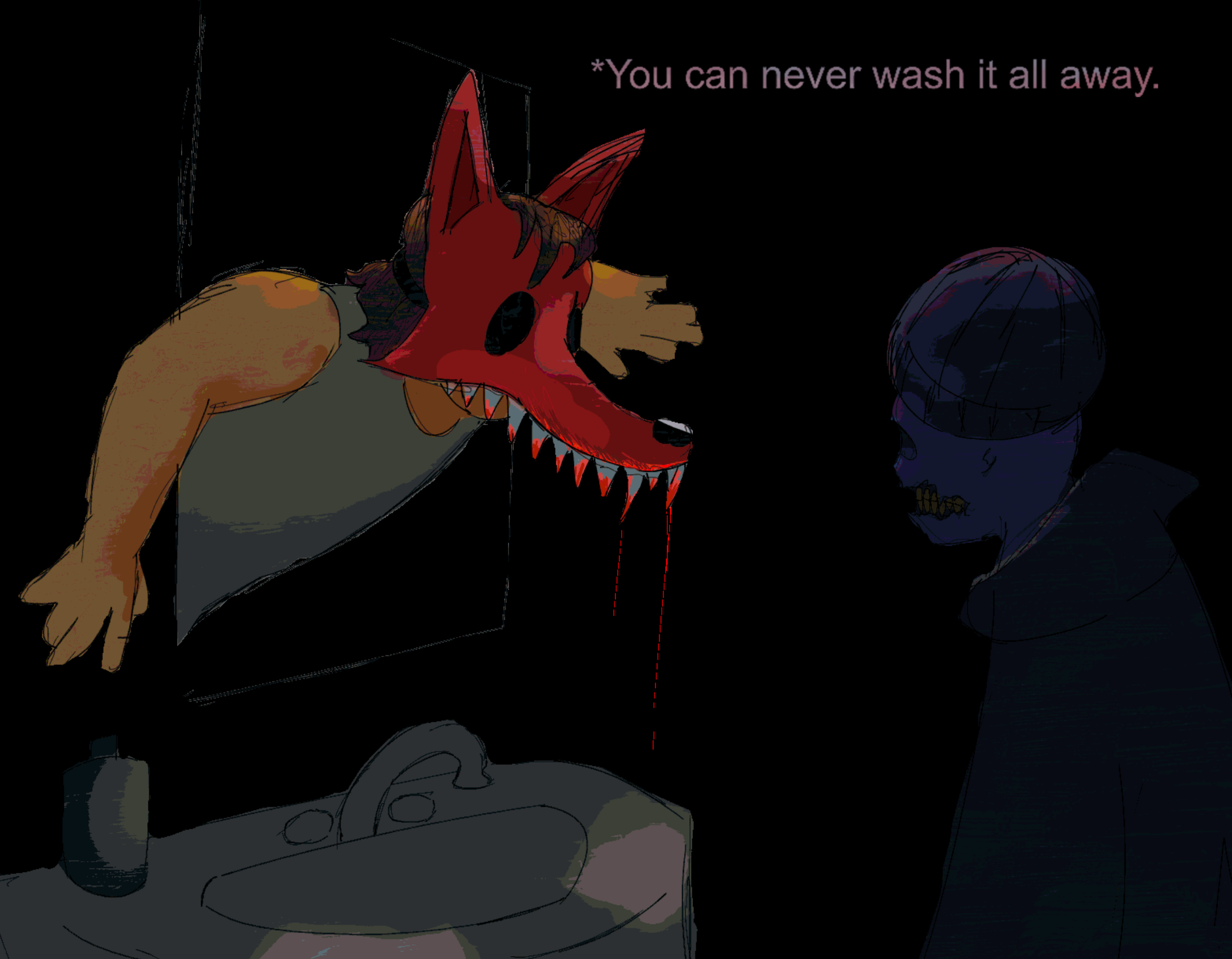
[Michael confronts a vision of his past]
I AM ALIVE!!!
I figured what better to drag me out of my drawing slump than my favorite character of all time, and so I drew my homeboy Mike again. This is a pretty fun idea, inspired by Kris from Deltarune (iykyk), so I wanted to play around with themes of the guilt that haunts poor Mike. I think the symbolism is rather clear in this piece; Michael will always see himself as that same terrible boy who took the life of his own brother.
I drew the mirror first in order to set the perspective of the scene, and then hastily sketched in the figures of Mike and... other Mike. My main philosophy was making quick lines and not getting bogged down in details. I used brushes with different thickness in order to add some variety as well. It took quite a while to get mirror Mike's pose right, but real Mike was pretty simple.
After the sketching was complete, I began coloring with a large, opaque brush. I painted in all the flat colors and erased what was over the lines before beginning work on the shading. For shading, I actually used the same opaque brush and just used a blending tool to smooth it all out. Shading was quite easy, with the light coming from the ceiling. I was originally going to have a painted background, but I thought the void looked cooler and was more striking.
After that, I moved onto filters and final touchups. I utilized a low opacity layer of highly textured brushstrokes to add some life to everything, before using my tried and true filters: burn and posterize. I played around a bit before I settled on something that I liked, and voila.
Overall, I'm quite pleased with this piece. It turned out much better than what I thought it would, and is proof that "trust the process" is a good mantra to live by. I'm quite fond of the foxy mask; the two fangs look pretty cool in my opinion. The colors and poses also look pretty cool. Of course, there are things I would fix, like the wonky anatomy in some places, but that's usually the case. All in all, I'm happy with this piece.
You Won't Die
May 6 2025

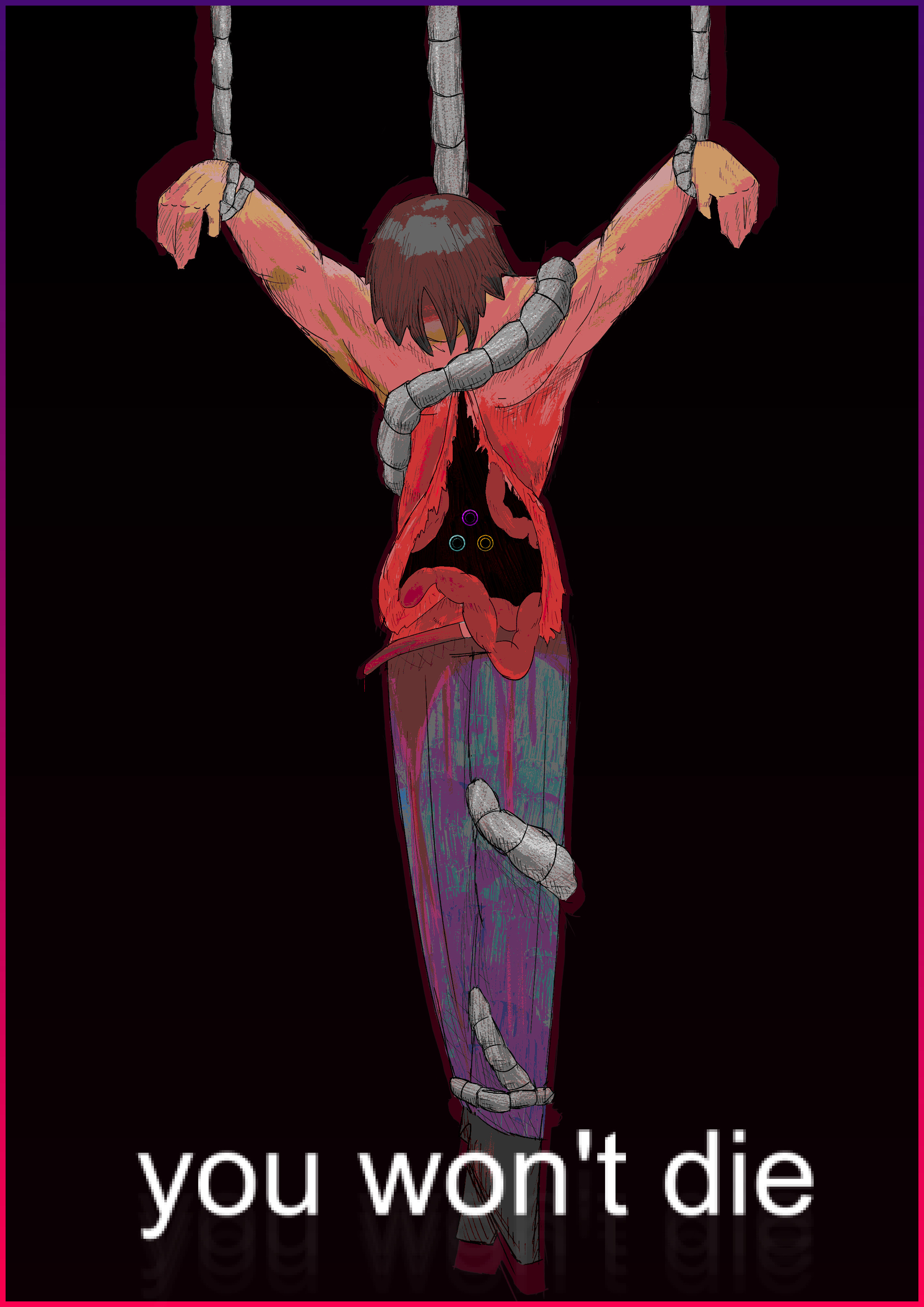
[Michael Afton is strung up after being scooped]
I've wanted to make a piece like this for a long time. The imagery of Michael Afton being strung up to evoke crucifixion is something that I've been playing around with in my mind for a while, and frankly, I couldn't be happier with the outcome.
I started this piece by doing a basic sketch of the pose and anatomy. I played around with that for a bit, then I started adding details. This piece was actually rather unique in the sense that I didn't have dedicated layers for sketch and line; I just refined the sketch layer and used it as my final line layer, which I think turned out really well and helped keep my original vision intact. It took me some adjusting to get the proportions finalized, but once I did, I began to do something that I hadn't really done before: hatching. I used my sketch brush to add some shading details via hatching instead of relying on pure color shading to achieve dimensionality. I didn't use a reference for the musculature, but I think the hatching really helped to convey the definition of Mike's build (something I wanted to emphasize). Once I had finished hatching, I was ready to start coloring.
I started by using a solid brush to fill in the base colors, making sure to use relatively washed out, muted colors, as is typical with my art. Once I had gotten my base down, I moved onto the finer details. I used a lower opacity brush to shade, placing my light above the subject. It took me some time to get the eyes in Mike's chest cavity right, but I'm fairly pleased with the result.
Once all that was completed, I moved onto the finishing touches. I used several filters (saturation adjustment, posterize, etc) to help add some pizazz to the piece. I used plain arial font just because I thought it was a cool idea, and after adding a gradient background and a border around the whole piece, I was ready to export.
All in all, this piece took around 3 and a half hours, and I am incredibly pleased with the result. The colors, the anatomy, the shading, it's all some of my best work I've ever put out, and I am very proud of what I created.
SPRINGLOCKED!
March 23 2025

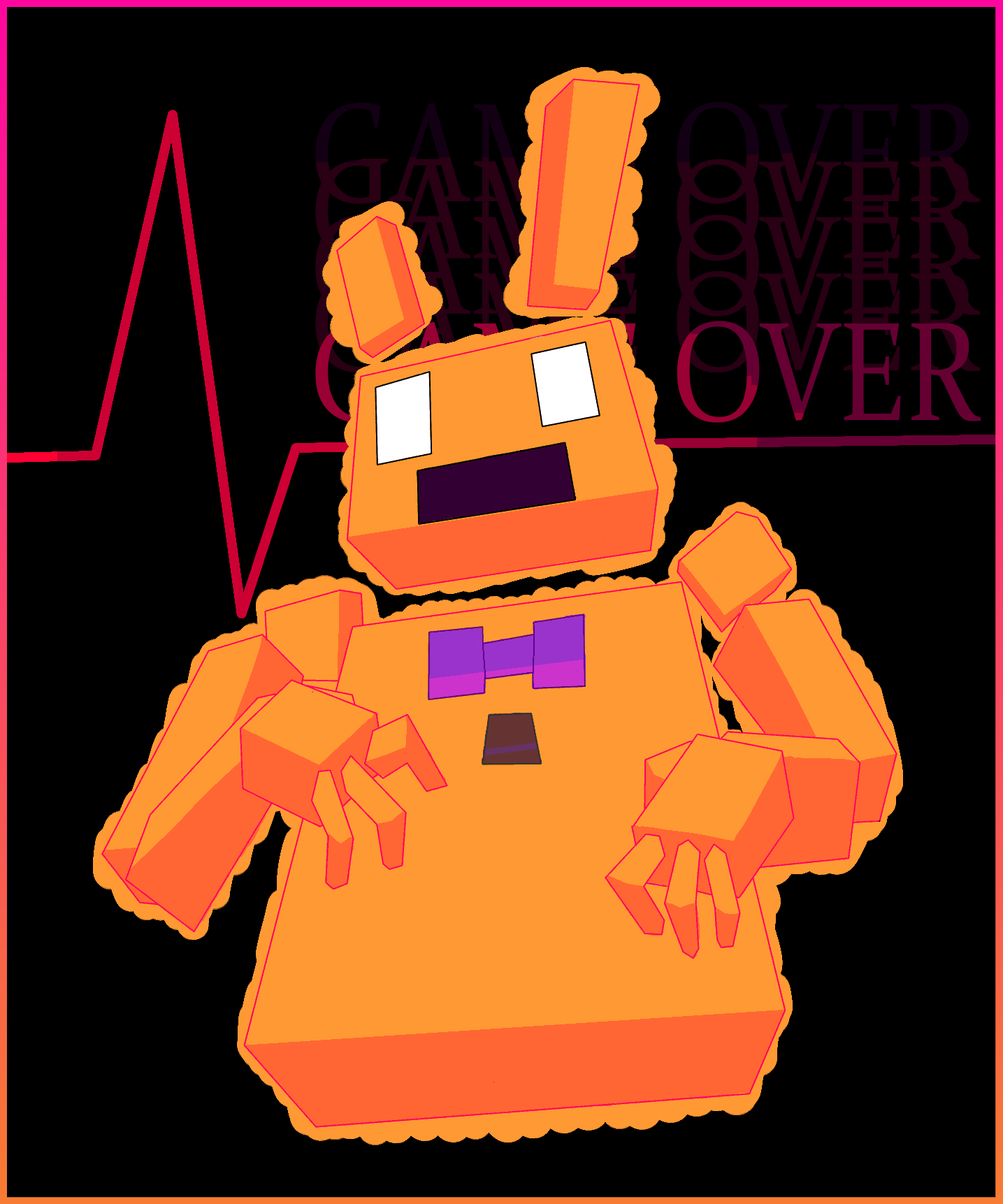
[William Afton is springlocked]
I wanted to make another one of those fun geometric poster thingies, and I figured the springlock failure was the perfect scene to capture. Not too experimental, but it's still a pretty piece.
Sketching was fairly straightforward, and lineart was just made using the straight line tool. Colors were typical, but I think the shading turned out pretty well. I really love the pink-yellow color combo and this piece makes great use of it I think. The background with the EKG is just an idea that I've always loved and so I figured I'd incorporate it into this drawing. The gradient border is also something that I used in previous pieces that I thought was a cool touch.
Overall, it's a fairly decent piece. It didn't really convey the energy or action that I wanted it to, but it looks nice at least. Not very experimental either, but I just wanted to draw something; it's been a while, after all.
Missing: Michael Afton
November 28 2024

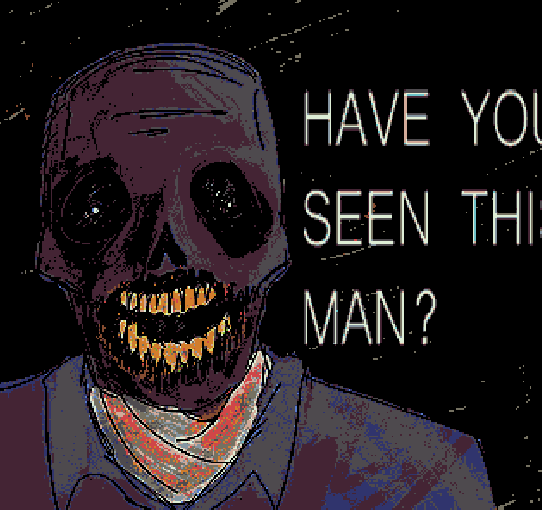
[Headshot of Michael Afton]
This is a drawing that didn't actually start out as a full piece, but I liked it enough to put it here (it was originally just a sketch of Mike in the pose of Willem Dafoe holding two oranges). I was really in kind of a Mike streak, and I was having a lot of fun painting him at the time, and I just ended up experimenting with this and it turned out really well I think.
Essentially what I did was I just used a very thin pen brush to make the lineart, then made that brush larger to make the flat colors. After that, I used a generic paintbrush to shade and paint. For Mike, I like to shade using blacks and even dark greens on top of the very dull, grey purple. I really want it to feel like necrotic tissue, and not just like, a guy with purple skin. I also used some faded reds around the mouth, just cuz like that part especially would've been kinda messed up. I actually had to redo the mouth a couple of times to get it to a point where I liked it. With that being said, though, I feel as though the teeth could have used some work. I think what would have been better is if I made the general shape of them first and then drew each individual tooth; my approach was more like just making a "wave" type line and then drawing the bottom of each tooth, which ended up making it seem lopsided.
For the eyes, I didn't actually intend for it to do this, but the two white lights kinda look like they're illuminating the back of the empty sockets, which I think is really cool. I think that just came about because of how I was coloring in the sockets. Also, I didn't use a reference for the skull anatomy, so it looks a little weird but honestly not too bad. The background was made just by painting broad strokes with a very textured brush in black first, then red, then another layer of black. Finally, I used posterize on the lowest step to make it feel more crusty. For the text, I just wanted it to feel kinda weird, so i used a font I don't use much and stretched it out a bunch. I think it looks neat.
The weird effects are what I think really make the piece. To start, I used sharpen to make everything feel all crusty. Then, I used posterize at a very low step in order to make it feel even more jank. I think I also ended up using palettize, just to make his skin seem a little more purple. I tried using pixelize, but it was a little too much so I scrapped it. Overall, I think the effects make it look really really cool. The word that comes to mind for me is almost "violent," like it just feels aggressive, probably cuz of the posterize and the text and stuff. I think moving forward I kinda want to lean more into this kind of art. It's, in my opinion, what's special about digital art when compared to traditional. You couldn't really make this kind of piece on a canvas, and while yes I do wanna do more like traditional-esque paintings, I also really wanna make more of this weird digital stuff. So yeah, I actually really like this one :D.
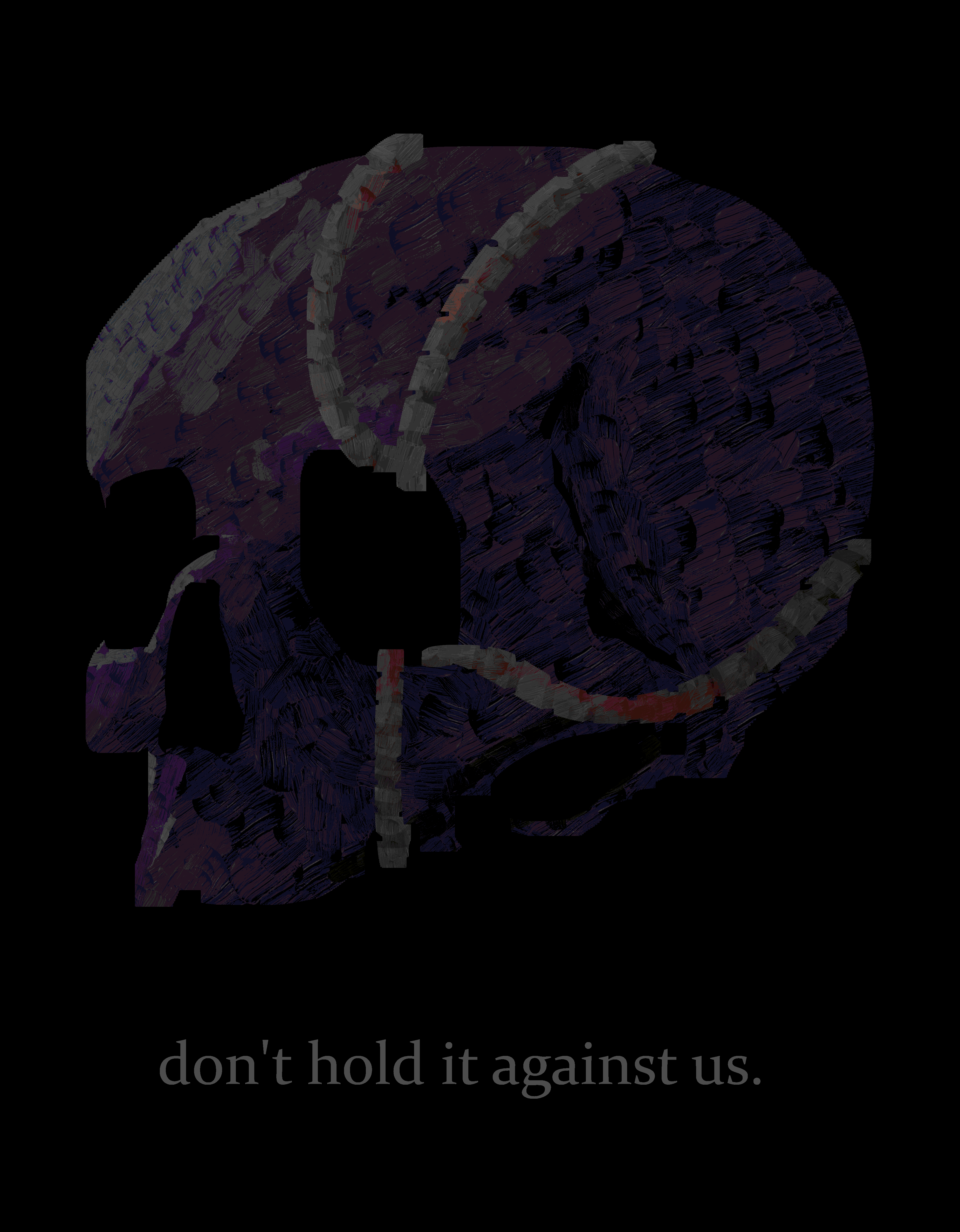
Don't Hold It Against Us
September 21 2024

[Skull of Michael Afton with Ennard's wires emerging from the eye socket]
I kind of knew what I wanted the piece to look like from the start; Mike's skull with wires coming in and out of the different holes in the face. To start, I used a large, plain brush to create the general form of the skull. I followed a reference pretty closely, so that's why it looks pretty accurate (in my opinion at least). It took me a while to get the eye sockets to a point where I was satisfied, but other than that it all went very smoothly.
Next up were the wires. These were slightly more challenging. It took me several different attempts to land on the configuration of wires that I did. Honestly, I could have probably done better with the placement of the wires; I think they could provide a unique opportunity to explore the contours of the skull. I also had trouble making them fit with the more realistic style I was going for. I ended up doing the sort of segmented look to them, which I did by just carving small sections of each wire with the eraser tool. I was actually inspired by the flexible cables used in shower heads, which is something I thought of quite a while ago but never really did anything with.
Onto the coloring, I first simply colored the main outline of the skull a greyish-purple and the wires a light grey. I ended up switching between a few different shading methods until I settled on using the brush I did. The shading of the skull was rather straightforward; I just shaded with regards to the light being in the top left. The reference helped a lot with figuring out the shading. Once again, the wires proved slightly more difficult. I ended up using a black brush on low opacity over the main color layer in order to color the connections between each wire segment. I did this just to add extra depth to the cables and make them seem more 3D. I also decided to add some light oranges for rust and a little bit of red for blood.
Lastly, I applied a few filters to round everything off. I adjusted some of the saturation values, then burned it (of course). I ended up palletizing it as well, which worked out pretty well, especially with making the blood stains on the wires far brighter than the original colors. I also posterized it, just for good measure. To finish everything, I added the text, which I played around with a bit before landing on the single line, all lowercase, low opacity format that I did.
Overall, this was a pretty fun piece to make. At the time, I was experiencing major artblock, so being able to just open Krita and make something was very refreshing. I think the piece itself is also pretty good; I'm particularly proud of the way the shading makes the zygomatic arch very pronounced (I think that's what that part of the skull is called). The posterior part of the skull could use some work though, it does look a little flat. Other than that, very satisfied.
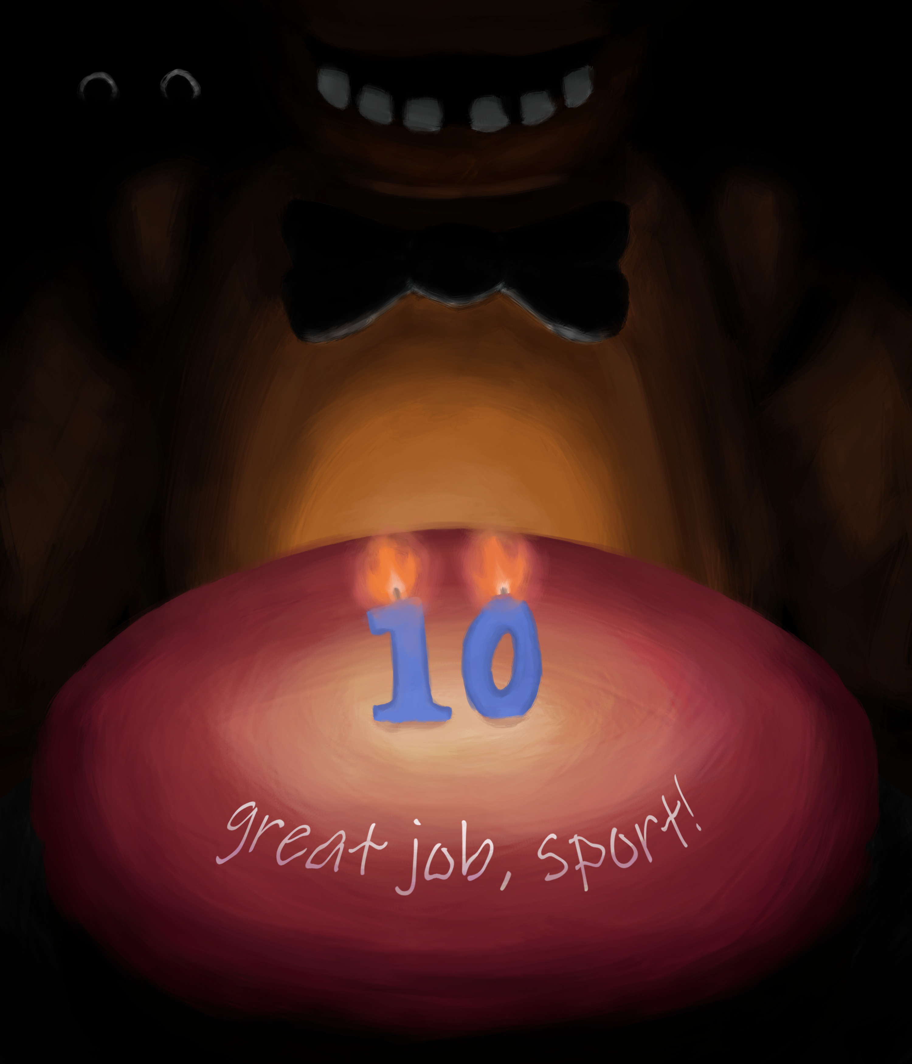
Decade of Overtime
August 8 2024

[Freddy and an anniversary cake]
For this piece, I really wanted to try something special, so I decided to try and actually paint for once. The OMC painting from before utilized the polygon tool to create geometric shapes and was more of a mix between digital lineart based drawing and traditional painting techniques. This time, however, everything was hand drawn (with the assistance of the symmetry tool). The original idea for this piece was quite different, actually. It was originally going to be a poster-style drawing featuring the Mimic, Springtrap, the classic 5, and a bunch of other characters. Then, I decided that it would be too cluttered, so I made a much simpler design. The main idea of the new design is just to emphasize the small beginnings of the franchise. I chose the text on the cake specifically from the FNaF 1 paycheck to add to that nostalgia (although apparently the text is actually "good job" T_T).
I started with a sketch, and then moved onto base colors. I used a generic paintbrush on Krita, and was really just experimenting with the brushstrokes. I was very much just seeing where my hands took me in that regard. It took me a while to get to where I was satisfied in terms of lighting; I didn't really have any references and was just kind of winging it. All in all, I think that part turned out decently well for a first attempt. I'm mainly proud of Freddy's main body. I think that turned out very nicely. The cake is alright, but not perfect. Also, I was debating whether or not to include those two eyes in the background, because I wasn't sure if they would read as eyes or not. I decided to anyways, obviously. I also didn't use any major filters, like posterize, on this one, unlike my other pieces.
I actually started this piece quite a while before the anniversary. I anticipated needing much more time to make it. In the end, I only spent about 4 hours on it. I'm actually pretty pleased with the result. It is by no means perfect, but I think it's a pretty successful foray into the world of digital painting. I also just had a lot of fun making this. The entire energy of the anniversary week was so wonderful. Again, read the blog for my full reflection on that.
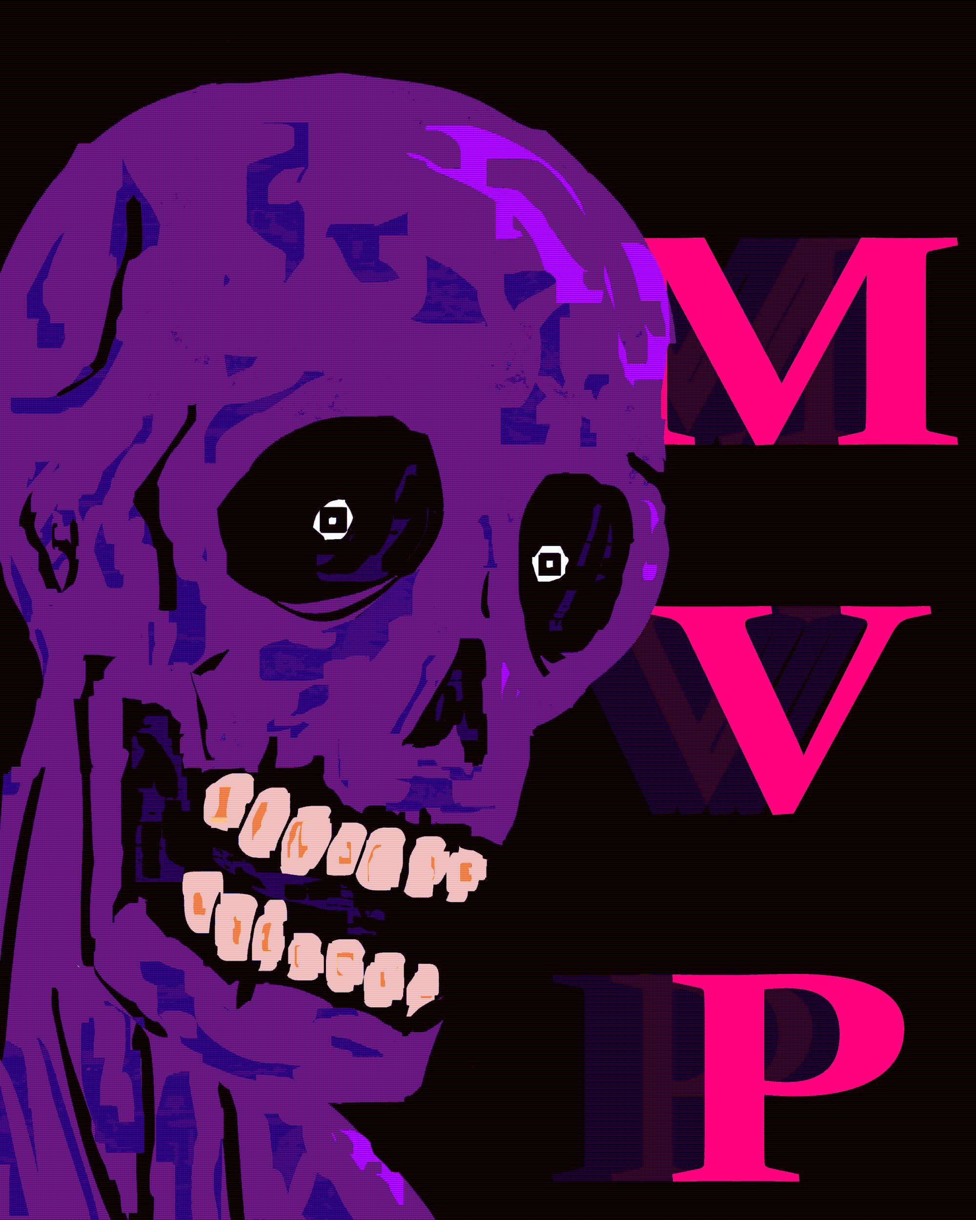
MVP
August 1 2024

[Stylized portrait of Michael Afton]
You're our MVP, Mike.
I definitely got a little experimental with this one, but I think it paid off. I had been watching digital paint tutorials and noticed a lot of artists had this sort of square brush that I didn't, so I managed to replicate it sort of by changing some settings in krita. Anyways, I was really quick and messy with the initial strokes, just mainly trying to get the form down without undoing too much. It was fun not getting too bogged down in details, as I tend to do that with my other pieces. I really tried to keep a good pace with this one.
I think the face itself is alright. I didn't use a reference, so it kind of looks strange in some places. Also, I didn't really put that much effort into the teeth, so they look kind of bad and out of place. The shading method I employed was strange, and a first for me. I essentially just shaded with the same brush I had been painting with, and then covered small parts of the shaded area with the base color, to make the strokes feel more jagged and less clean so that it would look more like mottled flesh. I think it turned out okay.
I used a lot of effects and filters on this one. I upped the saturation first, then applied a posterize filter, then palletized it, then added some dithering just because. I played around for a while until I settled on these effects. I like most of it, although I think the dithering might have been a bit much. It also leads to crazy compression and just makes the image look weird all around. Will probably avoid that in the future. Also, I do like how that text came out on the side, it helps fill in space and makes the whole piece feel a little more complete. Overall, this was a pretty fun piece to make, and I think it was a pretty successful experiment. I learned some more about what works and what doesn't, which is always helpful. If I were to make this piece again, I'd definitely use a reference and fix the teeth, and avoid using that dithering filter.
This drawing took around 1 hour 20 minutes.
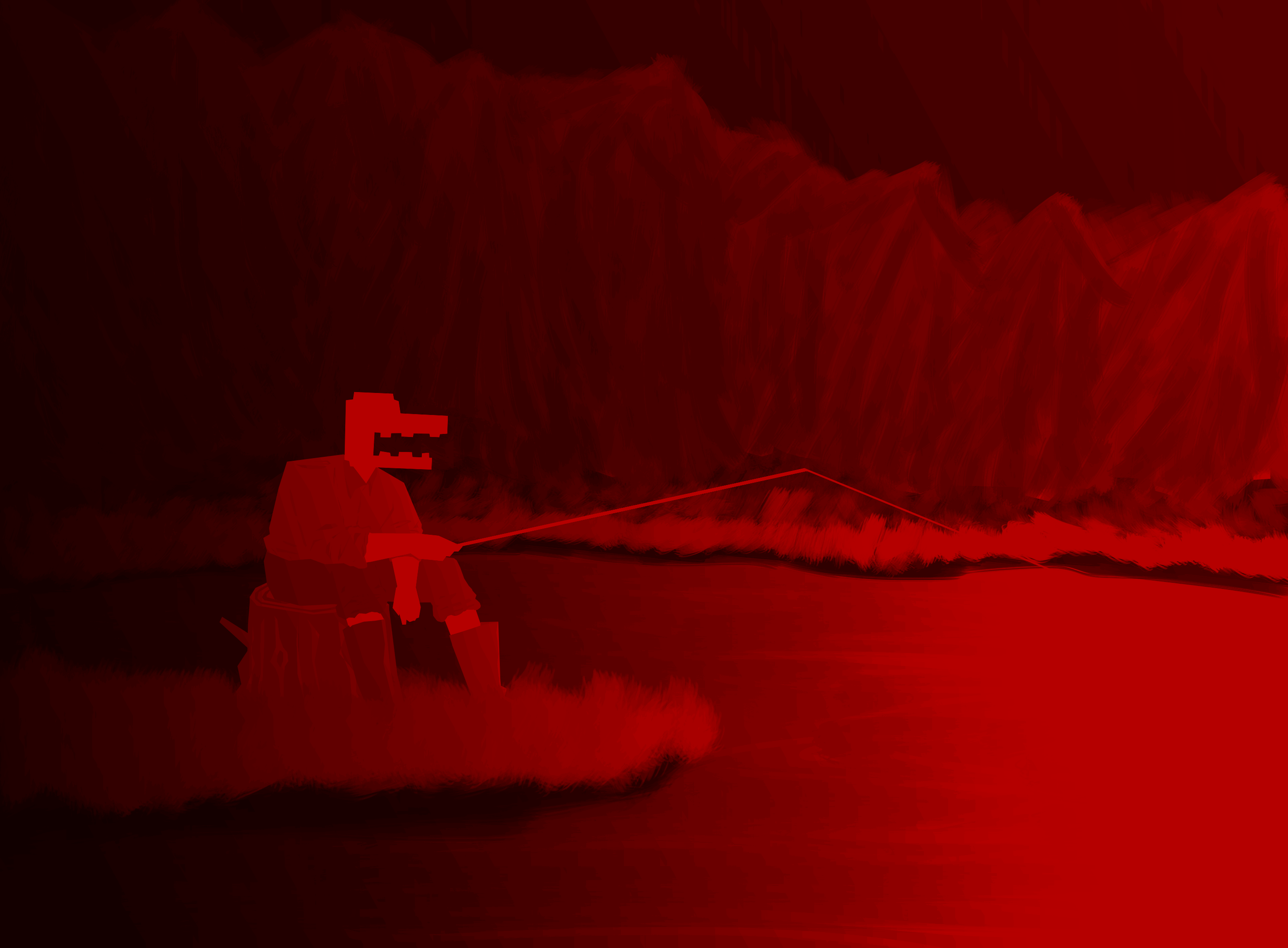
Gone Fishing
July 9 2024

[Old Man Consequences fishes at the red lake]
I decided to try something a little different this time. I wanted to draw OMC, so I started looking for some reference photos. I found this one online, and used it to get the pose of Consequences and the general shape and composition of the background. This is actually my first time trying digital painting (if you can even call this a painting), and in fact, my first time painting at all, really. I didn't know what to do, so I looked up a tutorial for digital painting and learned to use the polygonal selection tool to make geometric shapes. From there, I was shading it by hand. It took me quite a while to get
everything working.
I'm happy with how the water came out, and the grass is okay as well. Consequences himself looks nice, but the anatomy is strange in some places, like his left arm. I couldn't see the left arm on the reference, so I just had to wing it, so it looks weird. The trees are my main issue with it; I had no idea what I was doing. Overall though, I think the colors ended up really nice. The red lake is such a unique and striking location with the black and red contrast, and I always love seeing "realistic" interpretations of it. That being said, it took me a bit to get the colors to a place I was satisfied with. I played around with nearly every single filter on Krita, and used color balancing and burning to get what I wanted. I used the posterize filter, again, and as usual I'm pleased with the result. The only "issue" with it is that it makes the sky look red rather than black, but I can live with that.
If I were to make this piece again, I'd probably just learn how to paint trees, as well as maybe putting more effort into some places of OMC's anatomy. So, aside from a few nitpicks, I'm pretty proud of this piece and think it's a pretty good first attempt at digital painting. I'm looking forward to learning more about painting techniques and expanding my artistic capabilities.
This drawing took around 2 hours 40 minutes, although with the time spent applying effects and filters, it's probably a little over 3 hours.
Just a Nightmare
July 2 2024

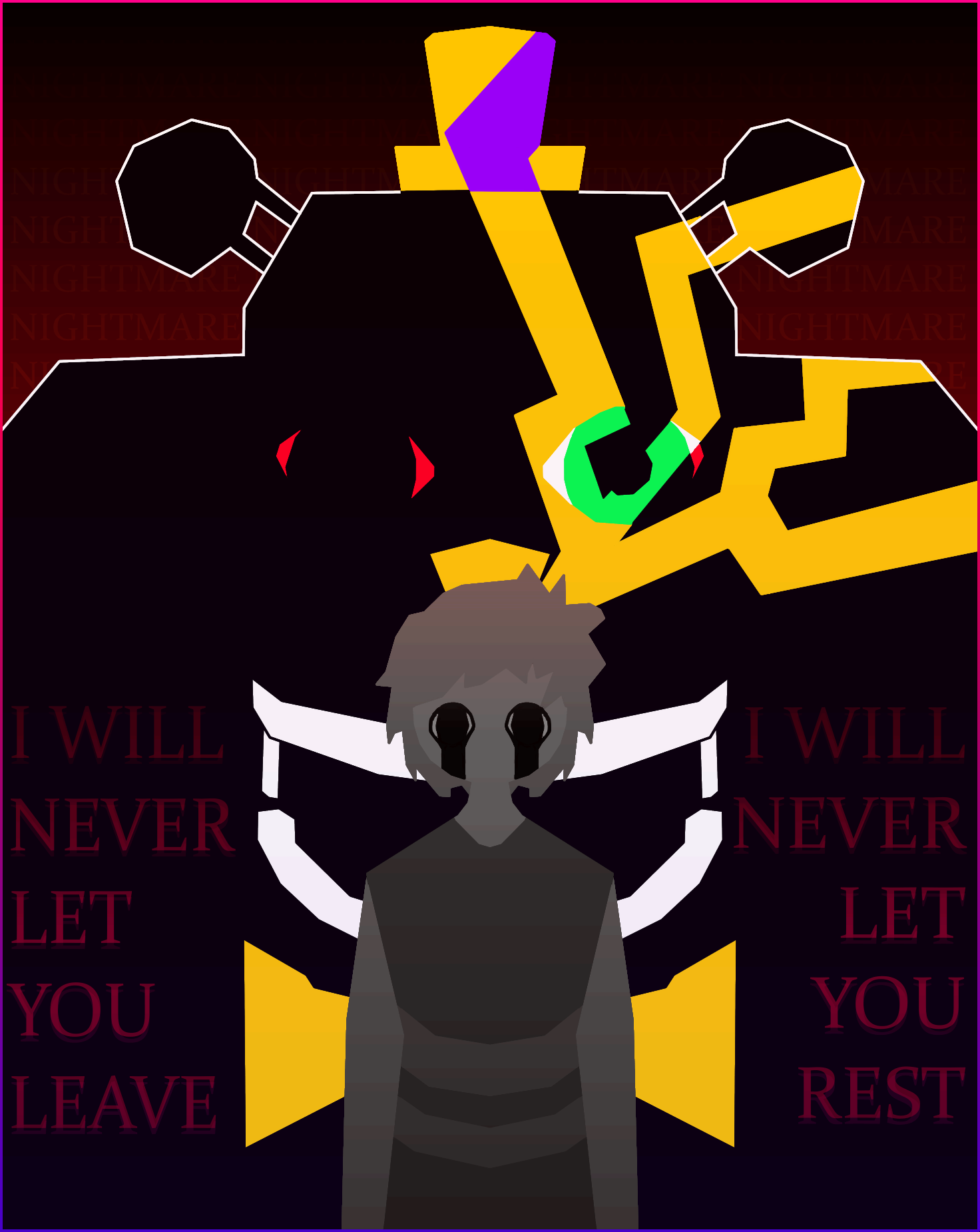
[Spirit of the crying child stands in front of Nightmare, promising to forever haunt his brother]
Sorry Mike! Looks like you're gonna have to be tormented in your dreams by your dead brother's ghost for the next 40 years. That's too bad. Anyways, yes, this is based on the idea that Nightmare is the crying child. Not really a popular theory, at least I don't think it is, and it probably isn't canon, but
from a storytelling standpoint I think it works pretty well. I've wanted to make a Nightmare drawing for a while now, and it took a good deal of trial and error before I settled on this look. As for piece itself, I think it turned out quite well. The colors and gradients work nicely, the text looks good, and just the general composition is nice I think. The rays coming out of the crying child's head that reveal Fredbear is a nice
touch I think, if somewhat unclear. The idea was that it was simply showing how Nightmare is the dark reflection of Fredbear, and how the crying child turned the means of his own death into a tool for torturing his brother (and also just a reference to the fact he sustained a head injury). Also, I made another border for this piece, similar to the previous one, and I think it'll probably be a staple from now on. At the very least, I'll add it to my toolkit in case I need it, because I really like how it looks. I also used the posterize filter, which is something I did back in my fredbear plush drawing, and I really like the outcome. The filter works particularly well for the wall of "NIGHTMARE" in the background, as it makes each line have its own step (kind of). Anyways, overall a very fun piece to make and I'm proud of how it came out. I make these poster style drawings often, so I'll definitely experiment with different styles and perspectives eventually. I still do enjoy making these posters though, so I'll probably continue to make them.
Anatomy of an Afton
June 30 2024

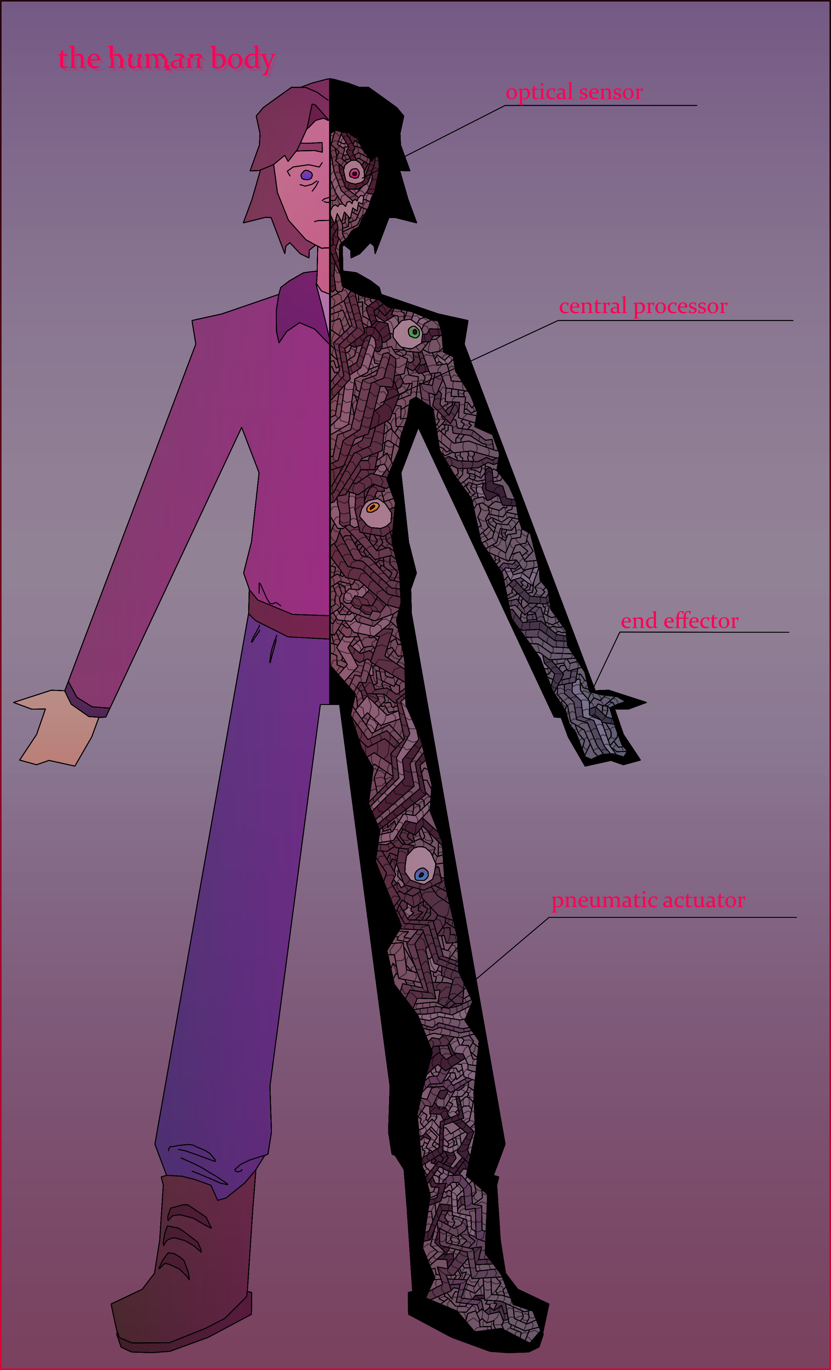
[Diagram showing Ennard inside of Michael's body]
Another poster style drawing, this one being inspired by classroom anatomy posters. Mike and Ennard are my two favorite characters and I always loved how Sister Location ended, and I thought this was clever. That being said, I'm not entirely happy with the result.
I think the idea is really good, but the artsyle may not have been right for it. I don't really know. The background is also not very good; I've never been great with backgrounds. I also made the image far too tall and it's hard to view normally without zooming out
and losing a lot of detail, like the wires. I'm also not sure how I feel about the gradients. I might remake this piece in the future with a different artstyle or coloring method, because again, I do really like the concept. I do like how the glitch effect on the word "human" came out, though.
Ennard himself also looks good, although the wires took ages to draw. Also I like how Ennard's eyes came out, I think they look nice.
I Will Put You Back Together
February 16 2024

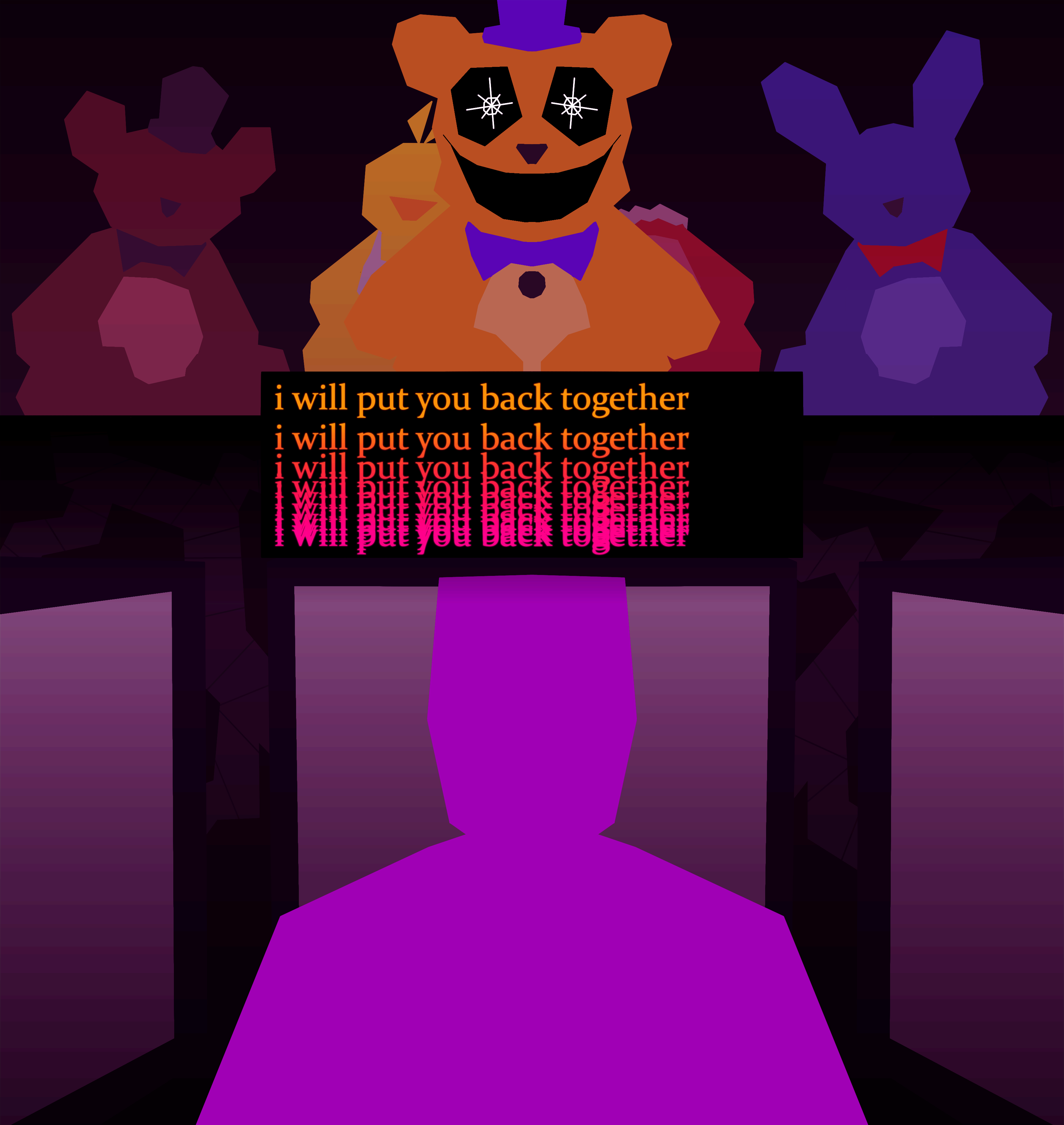
[William Afton talks to his son through the Fredbear plush]
Sister Location's recontextualization of FNAF 4 is... interesting. It raises a lot of questions but I also like it a lot. The original sketch for this was very different; it went
through a few iterations before I settled on this more abstract poster style. I've done other drawings like this before and I really like it. I wanted to go for a very geometric sort of thing, kind of like
low-poly video games. The gradients and the colors add to that feel too I think. This was actually my first time using a filter for a drawing (posterize filter on Krita)
and I really enjoyed it. Anyways, this one was overall really fun to make and I think it turned out really well.
The Vengeful Spirit
January 15 2024

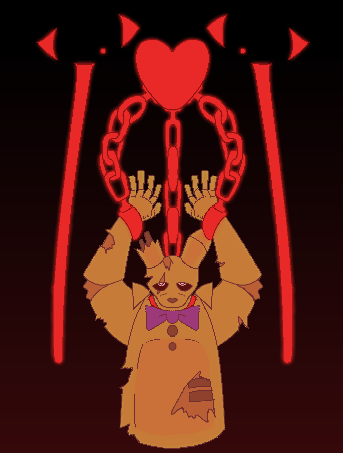
[Springtrap is bound in chains by the vengeful spirit]
UCN is a fun game. I made this one while I was still trying to figure out an artsyle I liked. I ended up using this pixel brush thing which worked all right. I really like how the chain links came out,
but the rest seems a little flat, especially Springtrap himself (I was going for the movie design where the hole in his torso exposes the springlock prong things but it didn't really work out).
Despite that, I do like the idea behind this one, especially the chains connected to the heart (cause it like represents how the vengeful spirit's soul is just as trapped as Afton's cause they're both in chains). Honestly the whole soul represented
by the red heart was very much inspired by Undertale and Deltarune; Chara and Cassidy are both wretched little children and I find that funny. Anyways, the red gradient isn't anything special but it's nice, and the colors are fine. Mainly it just
feels flat.
Lich-Trap
October 3 2023

[The Mimic/ Burntrap as the Lich]
I made this after watching the first season of Fionna and Cake. I'm not very proud of this one, but the file was in my drawings folder so I feel an obligation to put it here. The idea is fine, but I made it not really thinking of it as a real piece; it was really just me coloring in a sketch of a cool concept.
As a result of the lack of planning, the piece ended up feeling really bland and uninspired. In any case, it was a learning experience for sure.
SCOOPED!
September 27 2023

[Michael Afton is scooped]
Poor Mike. I tried doing some kind of dynamic pose for this one, but the anatomy is just a little weird. That aside, I like this one a lot; I think it has pretty good motion with the scooper and stuff. I also enjoyed doing the colors;
what I did was I made the flat base colors and then used a layer on top with a solid color (red or magenta I think) and then turned the opacity down. It worked pretty well at giving the piece an overall sort of reddish-purple tint. Anyways, I enjoyed
this one.
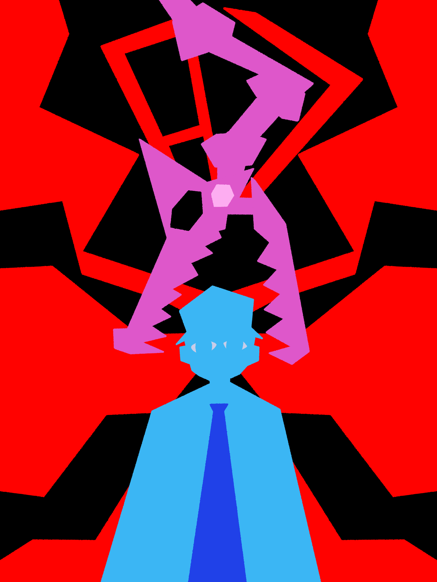
87
September 17 2023

[The Mangle prepares to lobotomize Jeremy Fitzgerald]
I remember making this one when I got really into FNAF 2 again; specifically I was focusing a lot on the Bite of 87 (obviously). This was the first piece where I did the "geometric poster style" type thing. I was originally going to do my regular style at the time but
I didn't think it fit very well so I just started messing around with line tool and the paint bucket. I think this turned out alright, especially
considering I didn't even use the symmetry tool for most of it. Mangle's head was inspired by dinosaur skulls and dragons, the red and black shapes jutting from Jeremy's head represent blood and agony (also I just thought it looked cool), and it took me a while to get the
87 at the top to look okay. Overall, this was a fun piece to make
and it definitely influenced a lot of my future works.
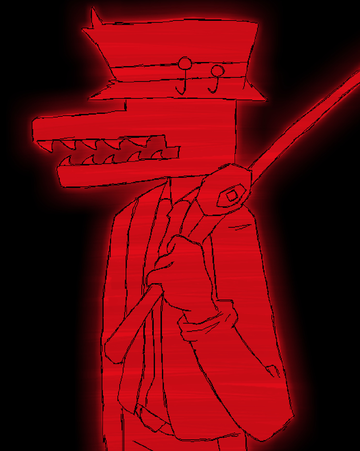
Old Man Consequences
September 15 2023

[Stylized portrait of Old Man Consequences]
OMC is a very fascinating character. He's like this super weird, psychopomp-deity thing. He's pretty much the W.D. Gaster of FNAF, it's cool. Anyways, this piece is a redraw of something I made back in 2022 (you can actually find it in the archive below!).
I like the way the colors pop in this one, I wanted to make him glow, and the bright red and the feathering effect work pretty well. Also the scan line effect thing was just me drawing a brush back and forth on a low opacity layer on top. This was one of the first times
I used the feathering radius on the fill tool to make something look like it's glowing; that ended
up being a pretty common tool for me which is neat. The lineart is nothing special, but I think it looks alright; I think the "sharpness" of it makes it a little more vibrant. In any case, it's a serious improvement from the original and I think it looks nice.
Archive
Click on purple guy to see a collection of old drawings!
