SKETCHES
SKETCHES, SCRIBBLES, AND DRAWINGS OTHERWISE UNFIT FOR THE GALLERY
Return Home
Designs

[July 13 2024]
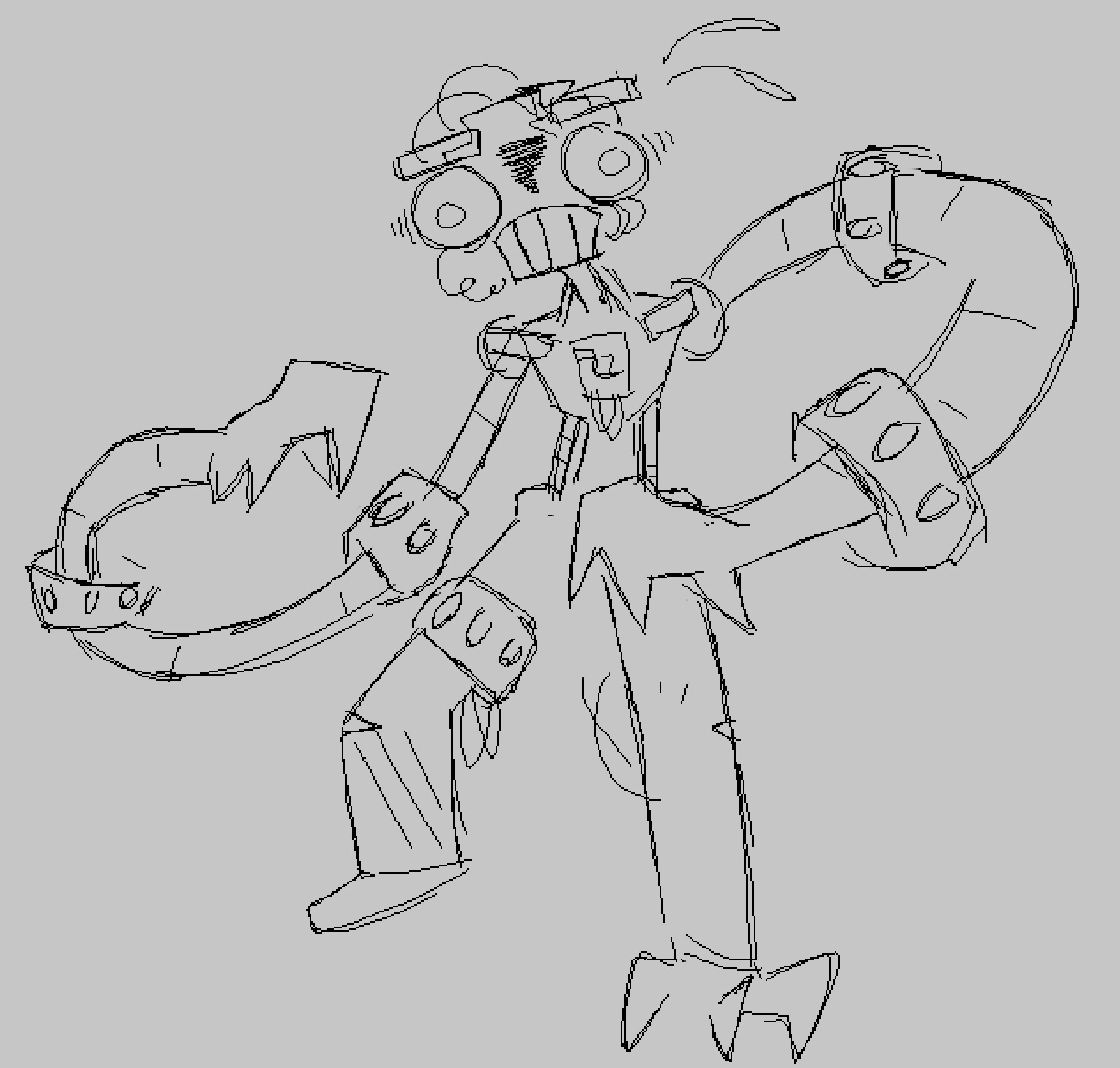
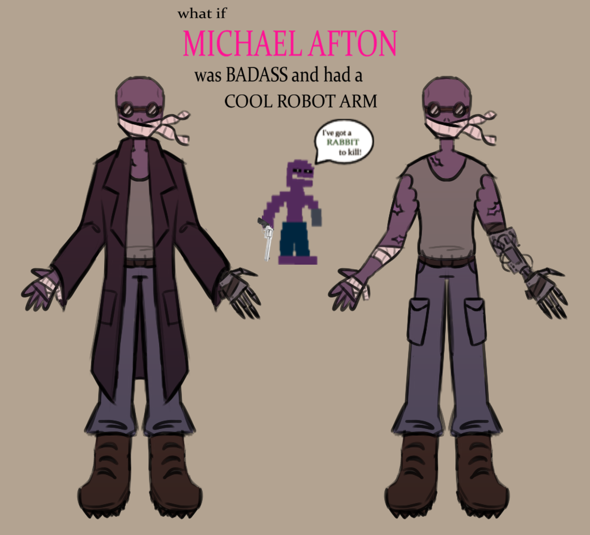
This is not actually my main Mike AU design, but it takes parts from it. The grey shirt is ripped to emulate the grey tank-top he wears as a teen, and the blue pants and brown shoes are also taken from his earlier color palettes. The trench coat is just a fun design thing that I thought looked cool. I got the idea for the robotic arm by playing gunslinger engineer in TF2, and I think it works well. I like to think that Mike lost his arm in the same encounter where Springtrap lost his, for parallels and stuff. The idea is that Mike scavenged parts from his father's old workshop and fashioned an arm out of it. It could be interpreted as him taking his father's work and using it for something good, or alternatively as a way to represent him growing more like his father (he's fusing with mechanical parts like Springtrap). Anyways, I like it. Also, the duct tape on the robot arm is meant to mirror the bandages on his regular one. The bandages on his face and the goggles were just chosen because it looked cool. The whole design was very much inspired by Hank from Madness Combat, because I wanted Mike to feel very active and athletic; the main idea was to take Michael and turn him into the protagonist of an action movie. In that regard, I think it works pretty well.

[May 4 2024]
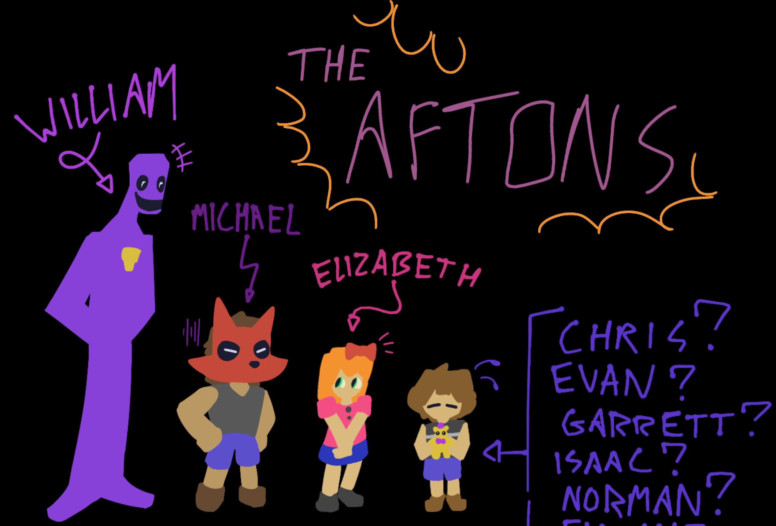
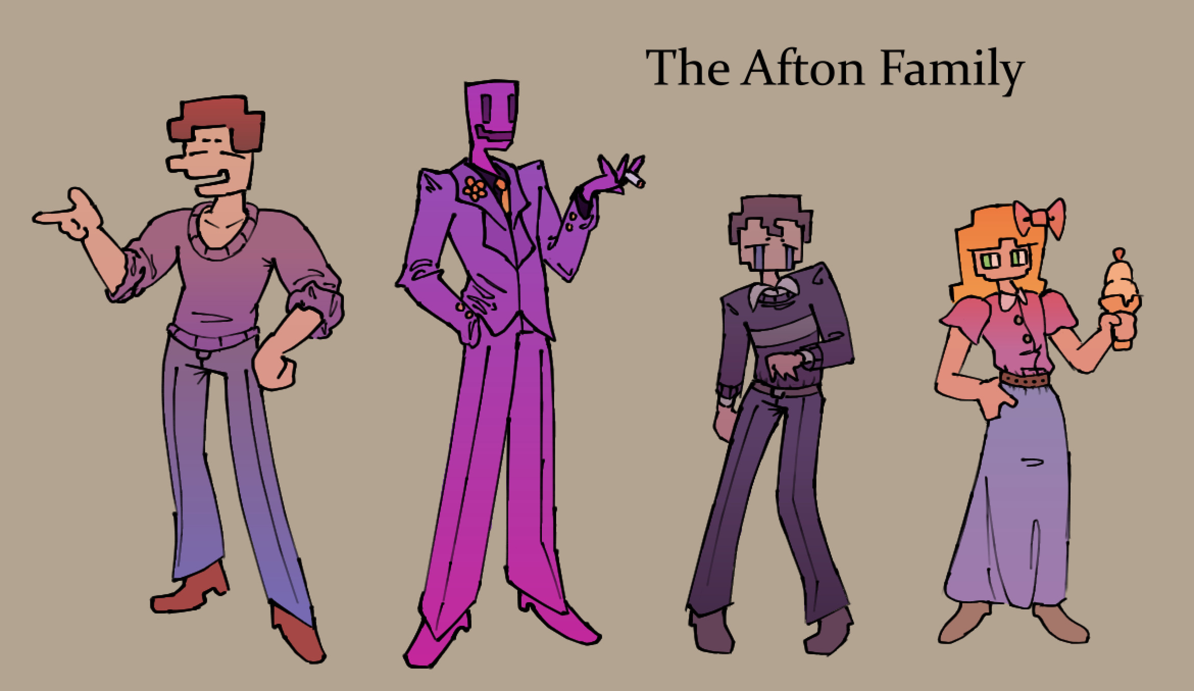
I'm just going to go ahead and group all four of these together, so this might get a little long. The original idea for this was to take the Aftons and "17bucks-ify" them, which is to say essentially give them some sauce and color them with gradients. Whether or not that vision was realized, I will leave up
to you. Also, I wanted them to sort of evoke this posh, British family feeling, so they all wear dress shoes, nice pants, prim-looking
tops (BV was intentionally designed to look like the quintessential British schoolboy). Honestly, I'm really really proud of how these guys look, this is one of the first times I've done one of these lineup style drawings where there isn't a single one I can label as "the worst".
Starting with Mike, I wanted him to feel cheery and bright, so I made sure to use light, somewhat
desaturated colors for him. I wanted him to be visibly more muscular than the other ones, and he sort of fills out his clothes more, if that makes sense. As much fun as wretched skinny twink Mike is, I think him keeping some of his rougher, stronger characteristics from his teen years works really well. Also, I had a lot of fun drawing the clothing folds and creases, I've always been terrible with those but I feel like I'm finally starting to get the hang of it somewhat. Overall, Mike is my favorite of the four, I think his posing flows really well and the colors and lineart are some of my best work.
Onto
William, his design is one that I've had in my mind for a while now, but never been able to realize until now. I think the purple suit combined with the black shirt and gold accessories makes for a really pleasing color combination. One of my favorite details about him is that he has a golden lapel flower to
evoke the yellow security badge he wears in Save Them. Also his face was really hard to get right, but I'm pleased with it. Another thing, I intentionally made his pose similar to Mike's because y'know, "they thought I was you" and all. Overall, I think William was really well done and I'm glad I was finally able to show off this design. Also I just have to mention, I like how his jacket sleeve droops down at his wrist, and
his hand also ended up looking really nice.
Next up is the Bite Victim, which was the hardest one to get right, even though
his design is one of the simplest. It took me 3 or 4 attempts to get his posing and lineart right, but I'm overall content with the final product. Something interesting with BV is that his color scheme is much darker than the other 3 Aftons, as his shirt is a dark navy/ black color. This made it somewhat challenging
to get a nice color palette going for him, as the other three all had very bright color schemes with lended themselves well to a light, lively look. Because of this, I ended up going for a much darker palette for BV, using dark blues and purples instead of magentas and pinks. I think it offers a nice contrast to
the others, for what it's worth. Also, his clothing is a lot less loose than the others, so I didn't get to draw many clothing folds unfortunately. Overall, I'm content with this design.
Lastly, we have Elizabeth. I had a very clear vision of what I wanted Elizabeth to be at first; she was always supposed
to have a very airy, summery feel to her clothing, and I was originally going to give her a flowing floral pattern dress to go with that springtime feel. I ended up not doing that because it was a little too off-model, even for me, but I did keep the idea of a longer bottom, as I felt the shorter skirt wouldn't
lend itself to what I was trying to achieve. I had a lot of fun drawing Elizabeth; I almost never draw dresses or skirts so I'm happy with how it came out, especially the folds. I also really like how her hair came out; the yellow-orange gradient creates this really nice strawberry-blonde color which I think
looks great. I do have to say Elizabeth is probably my least favorite in terms of posing though, and I had a lot of trouble figuring out what to do with her arms. Also, her anatomy at the shoulders really bugs me, and I feel like she doesn't have as much life to her as the other three. That being said, I'm still
really happy with how she came out.

[December 29 2023]
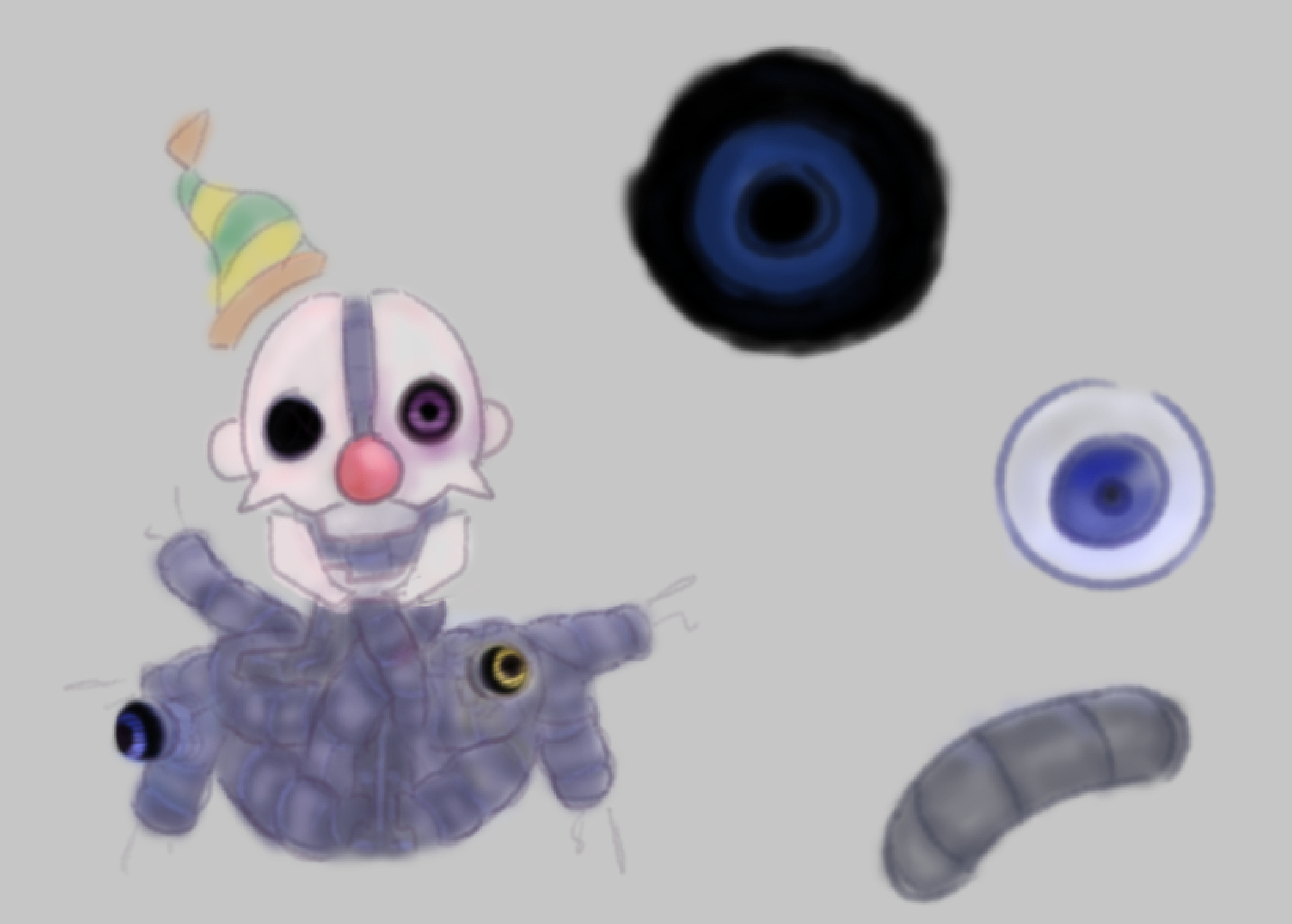
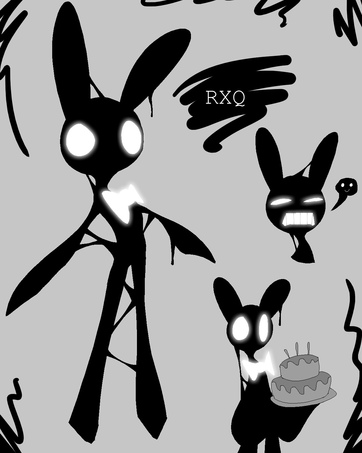
This RXQ is essentially the manifestation of the hope of the missing children (That's how my versions of the shadows work; they're all physical manifestations of human emotions. Also it's unclear whether or not they're actual real or purely symbolic. I thought that would be fun).
I wanted him to feel very fragile; he's a creature made up of weak emotions (The situation of the missing kids is rather dismal) but he's also
a symbol of hope. That's why his accent color is white; it embodies the hopeful, almost angelic vibe going on. His whole deal is that he is responsible for happiest day (Cassidy being freed from UCN), kinda representing love and hope overcoming rage
I think. I also wanted him to feel kind of like an alien or strange creature; he doesn't really understand
human things so when he tries to smile it just looks like he's grimacing. I thought that was fun. Also I made him goopy because I thought that was also fun.

[December 31 2023]
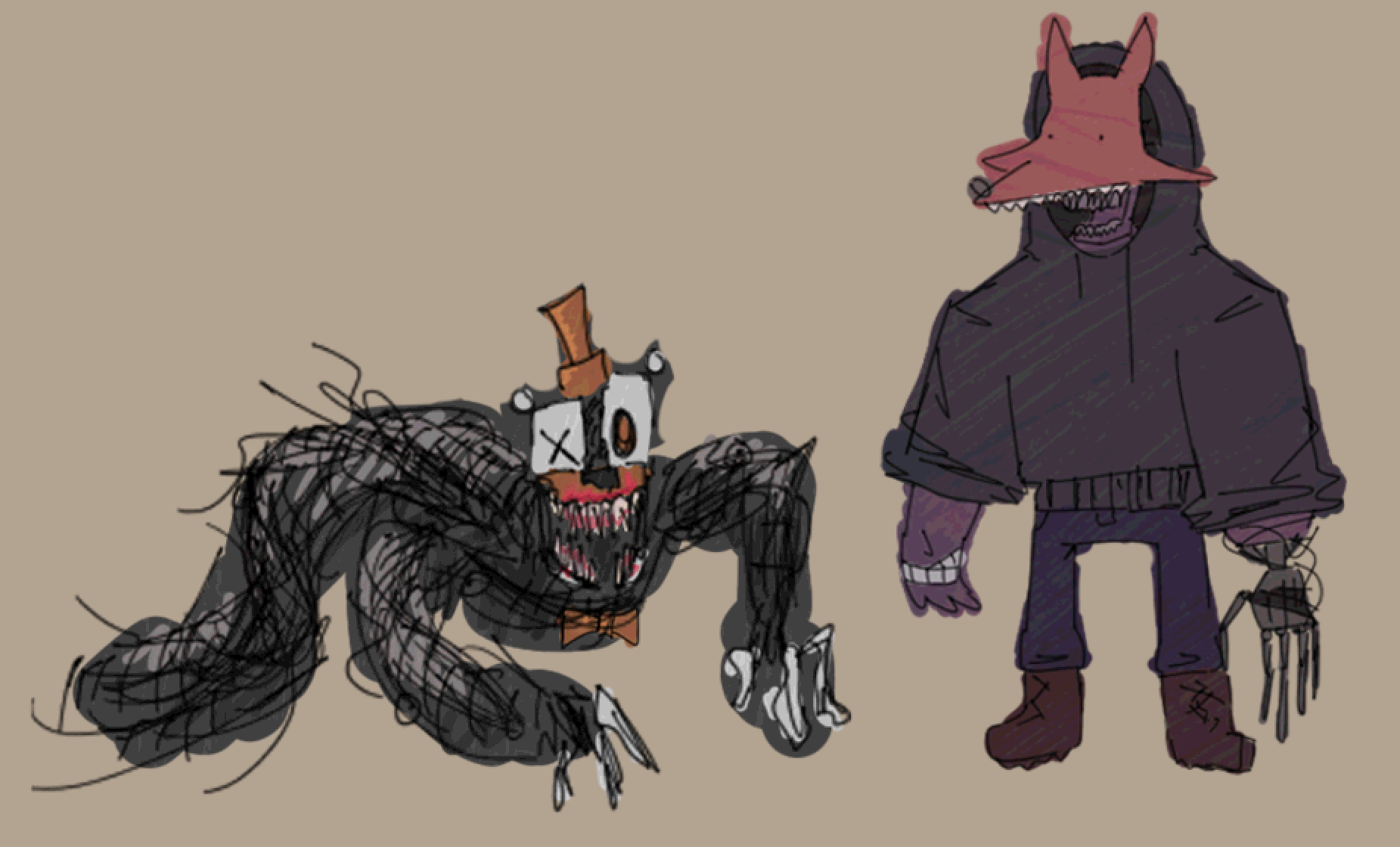
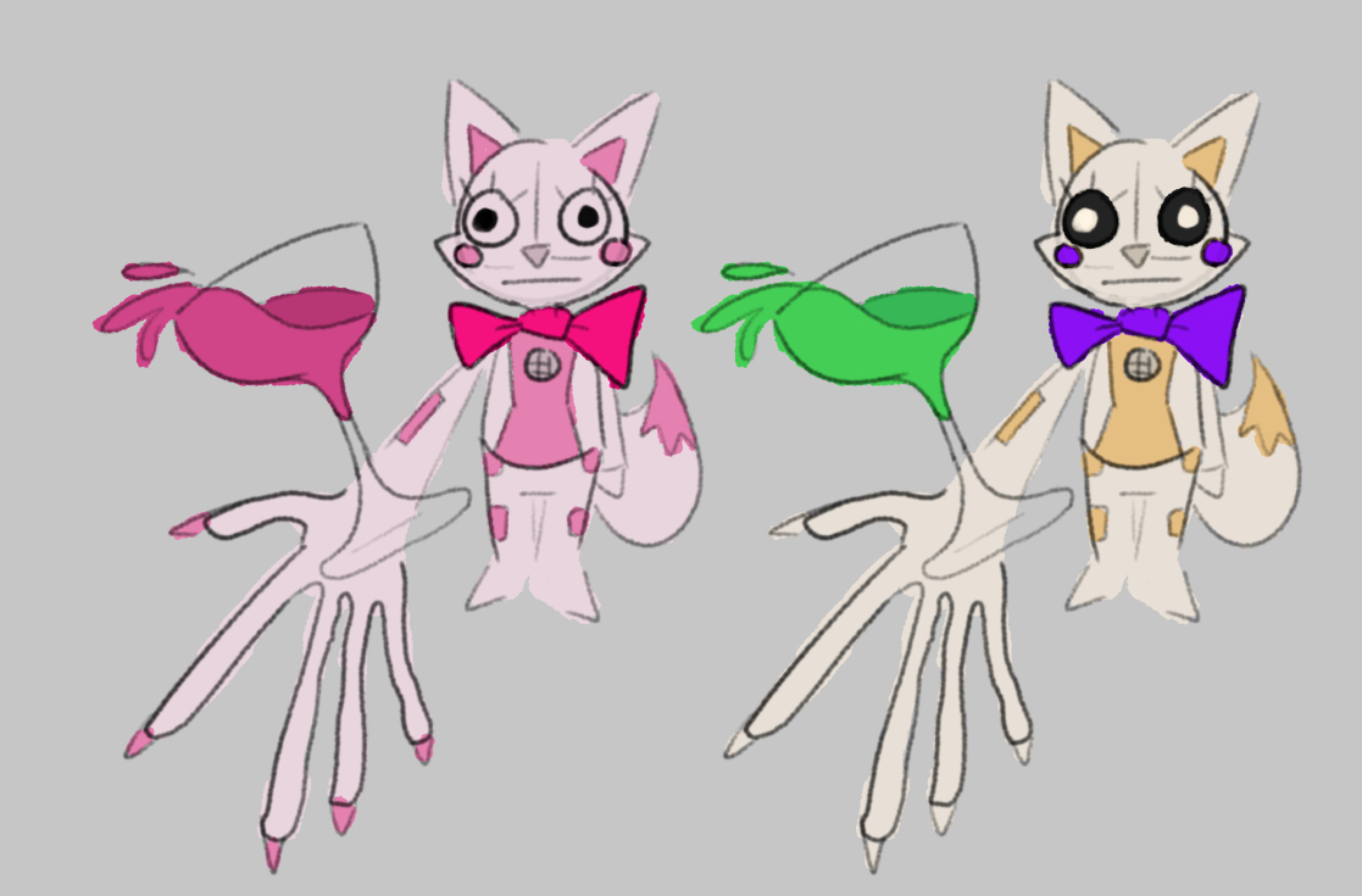
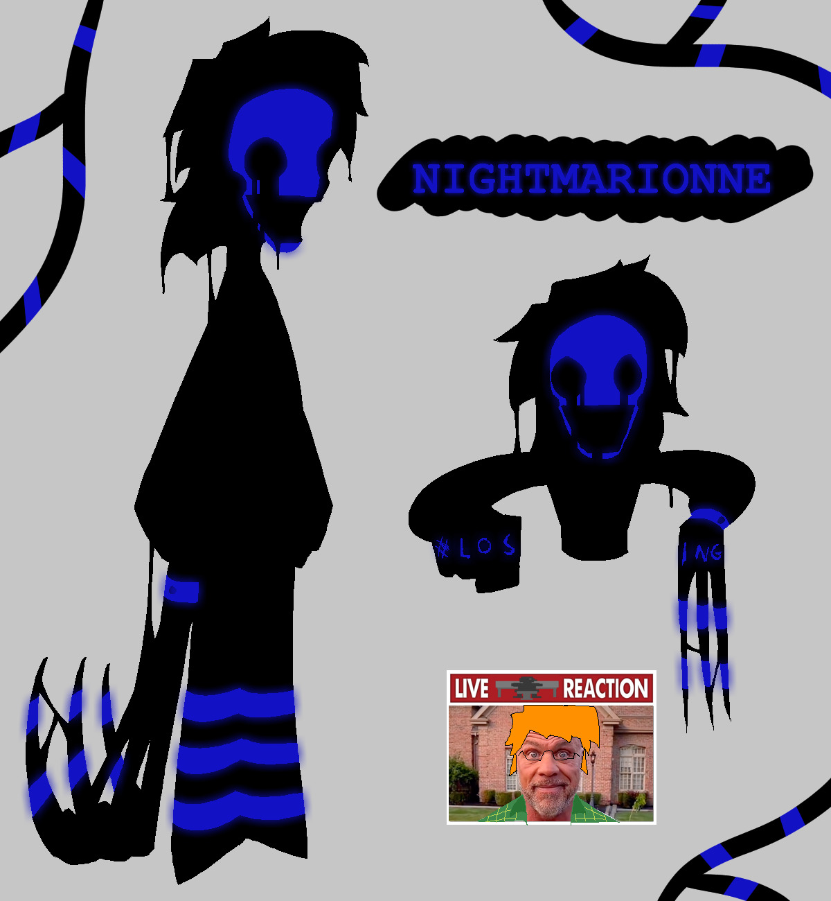
This Nightmarionne design represents Henry's guilt over the events of the story, specifically Charlotte's death. Her main accent is blue, representing Henry's sadness and self-loathing as he blames himself for Charlie's death; That's why this design is essentially just
a shadow version of Charlie. Her right hand, the one with the wristband, is the monstrous one; a constant reminder of the failure of Henry's security puppet. Her deal is essentially that Henry can't let go of what happened, and he lets Nightmarionne consume his entire life,
explaining why he is essentially MIA for like 40 years; he doesn't believe he can do any good after what he sees as his mistake or something like that. I imagine she serves a very similar role to Nightmare, with some key differences (Nightmarionne is Henry obsessing over what he did while
Nightmare is Michael failing to accept what he did). She is also goopy like RXQ because I guess that's just how the shadows look in my version of the story.

[January 1 2024]
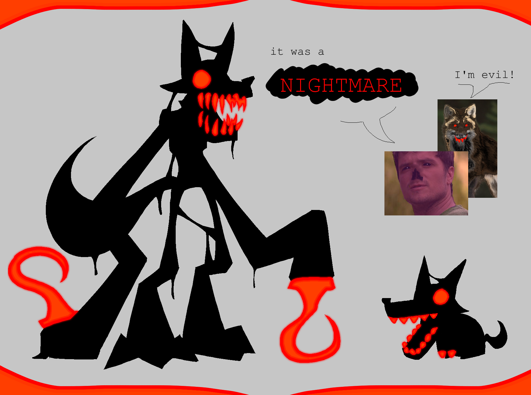
This version of Nightmare represents Michael's grief over the Bite of 83. I wanted him to seem very monstrous, so I made him very lanky with unnatural proportions. I also wanted his eyes to seem like they were glazed over or unthinking, so I didn't give him any pupils. His main accent is red/orange,
representing Mike's inner turmoil I think. That's also why he's a fox; Michael doesn't want to believe that he's responsible, but deep down he knows it; he was wearing the fox mask so Nightmare takes the form of a fox. The way it works is essentially Michael is unable to accept his role in the Bite, and he distances himself as much as possible from it. The result of this
is the formation of Nightmare, the entity that Michael blames for the Bite. Nightmare is taunting Michael and hangs over him; he's essentially saying, "It was me" all the time, reminding Mike that Nightmare was responsible for his brother's death. This isn't true, of course, and Michael is only
able to defeat Nightmare by taking responsibility for the death of his brother and making things right. I imagine this happens in between FNAF 3 and Pizza Sim, as Mike realizes that taking revenge on his father isn't the way to atone for his mistakes, and instead he shifts his goals to freeing the
remaining spirits. I think that makes Mike's story pretty satisfying, at least. And of course, the obligatory goop factor. Gotta have that.

[October 7 2023]
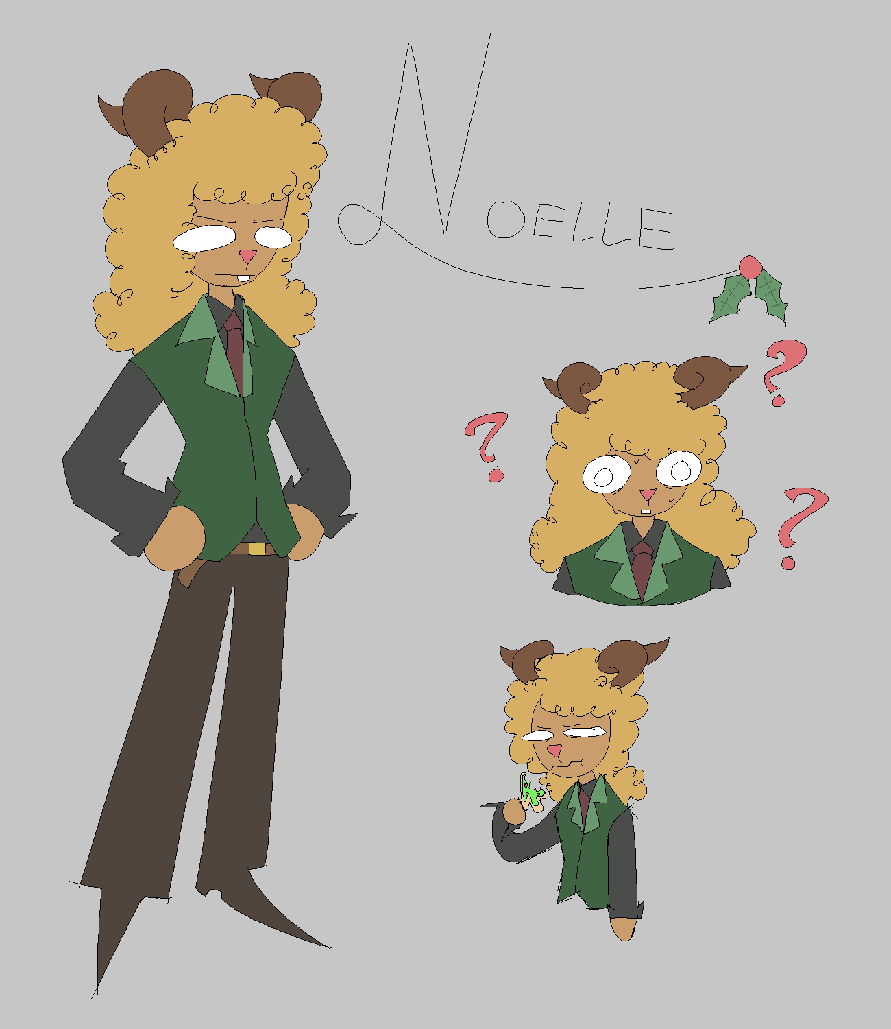
This one was more motivated just by what I thought looked nice rather than any real narrative significance, because to be honest I'm not as in tune with the themes and story of Deltarune as I am with FNAF, so I don't have that wealth of knowledge to draw from when considering the implications of certain design choices. I kind of just wanted her to look more "business" like sort of, taking after her mother since she's the mayor. I also added the curled horns because I had just watched Fionna and Cake at the time and I liked the Lich a lot so that's where those came from. I like the idea that her color scheme was made to resemble a Christmas tree; brown pants as the trunk, green and red vest and tie for the leaves and the ornaments, and yellow hair at the top to represent the star at the top of the Christmas tree. That last part may not have been obvious, which is understandable because I didn't even come up with that idea until after I had made the design X_X. Anyways, I warmed up to Noelle a little while making this design. Honestly, she was always my least favorite out of the main characters, but now I think she's pretty neat.

[September 26 2023]
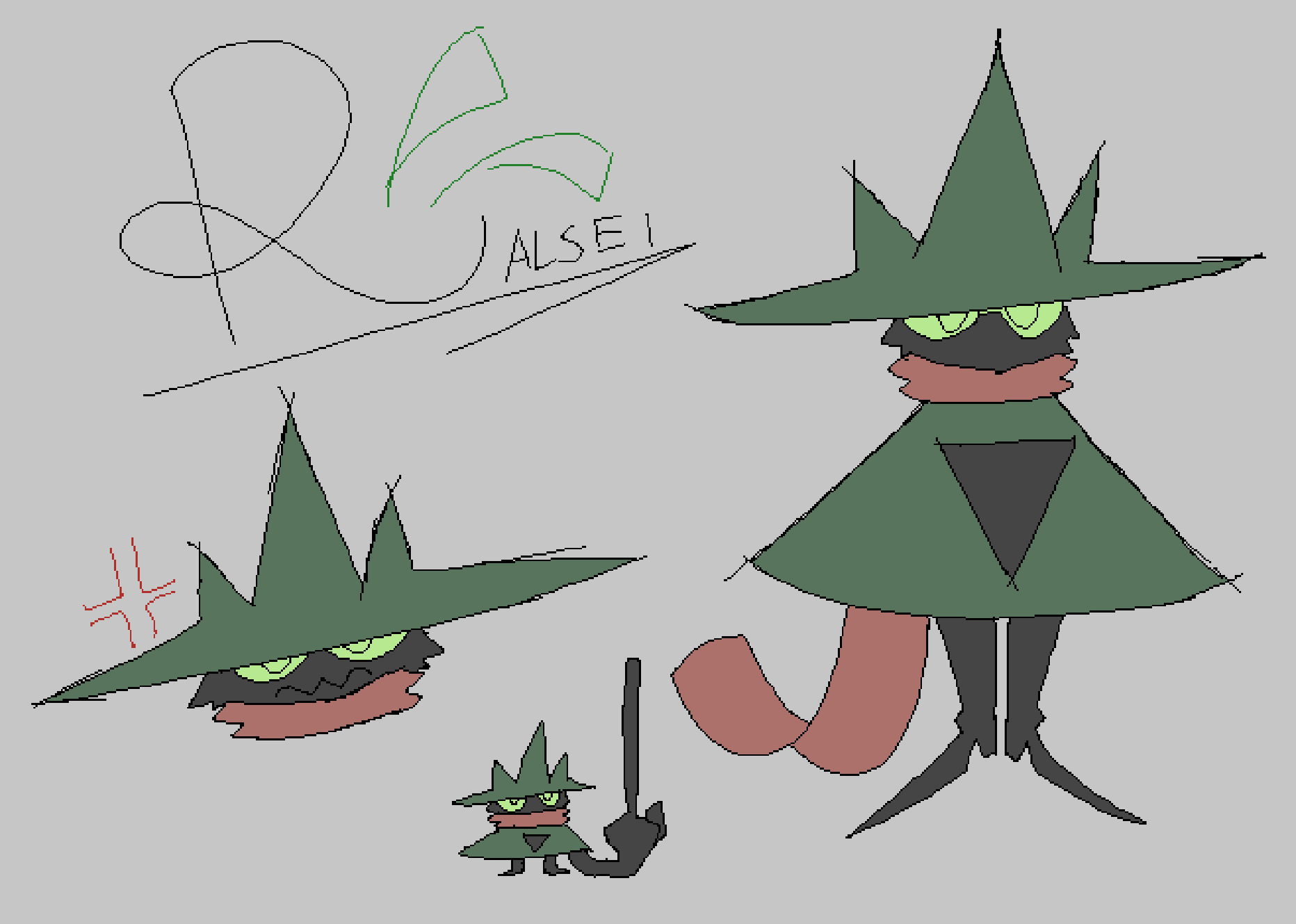
This design was just made for fun. I wanted to redesign Ralsei to make him a little more like a cartoon character. I suppose some of the inspirations for this were probably things like Hollow Knight, especially with the wide dress and small legs. I wanted him to look kind of grumpy and more like a weird spider monster than a goat. Also, he wears boots because I thought that would be fun. Maintaining a strong shape language was key for me
here, so I tried to really exaggerate the sharp corners of his clothes. The weird dress tunic thing flaring out a lot was fun to draw, and I liked making his eyes connect to the brim of his hat. Overall, he's just kind of a grumpy little guy and I like him quite a bit.
Doodles
(In no particular order)

